A tennis brand experience beyond the court. During the 2022 US Open, an activation on the fourth floor of Nike’s New York headquarters welcomed visiting athletes into an environment combining tennis heritage, product presentation and personal expression. Graphic storytelling and spatial design connected the brand’s past to the players shaping its future.
VENUE Nike New York Headquarters · Fourth Floor
ROLE Graphic & Spatial Design
FORMAT Athlete Experience & Brand Activation
01 — The Brief & My Contribution
The brief was to create a visual and interactive environment for athletes visiting Nike during the US Open. The space needed to bring several stories together: the brand’s tennis history, the people behind that history, and the apparel and accessories presented in the room.
My contribution: I contributed to the project’s graphic and spatial design as part of the event team. This case study examines how imagery, typography, display elements and guest touchpoints worked together in the completed installation.
Establish the Nike tennis identity.
Connect athletes, archive and brand history.
Bring apparel into the physical experience.
Invite guests to leave a personal mark.
02 — Arrival & Spatial Identity
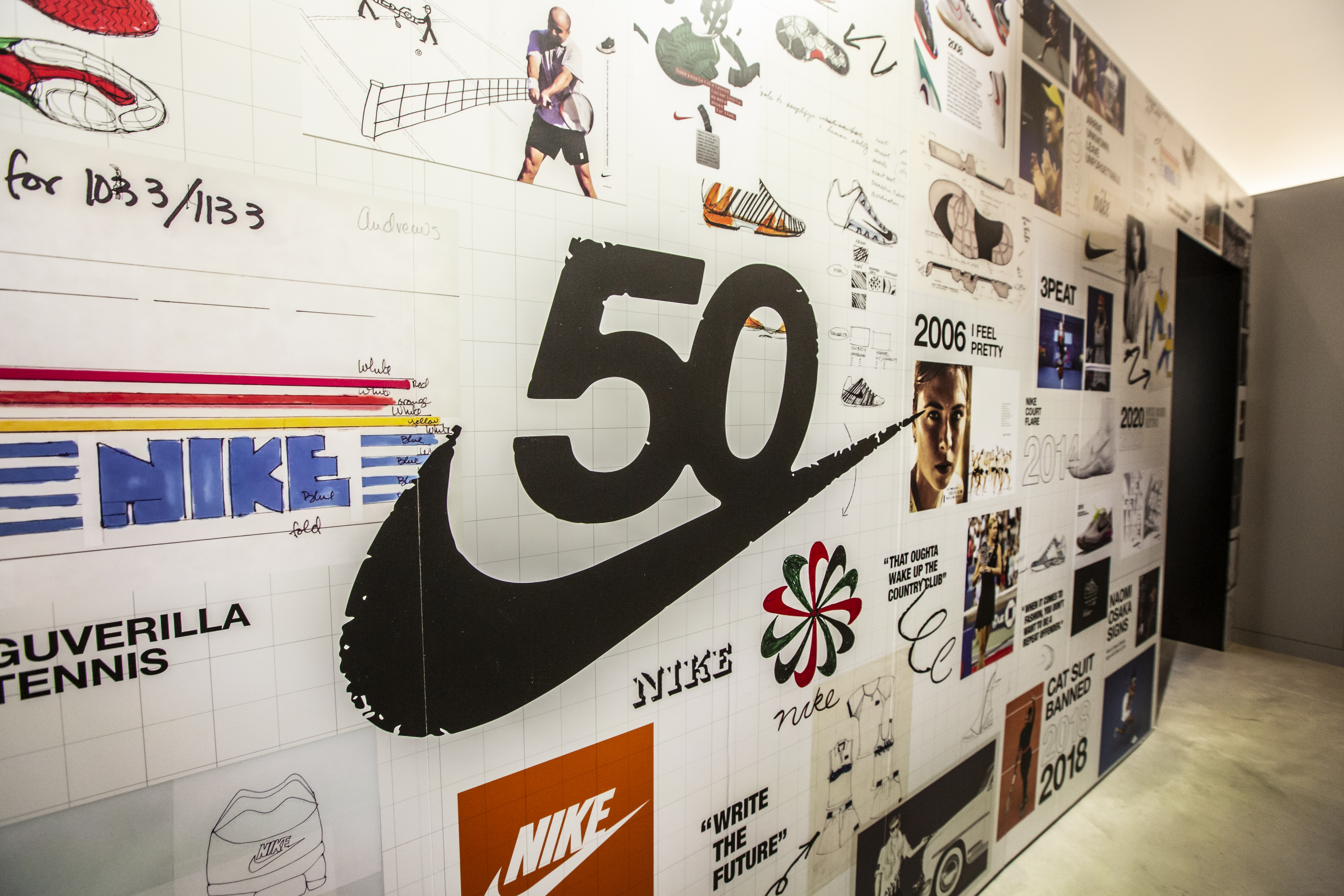
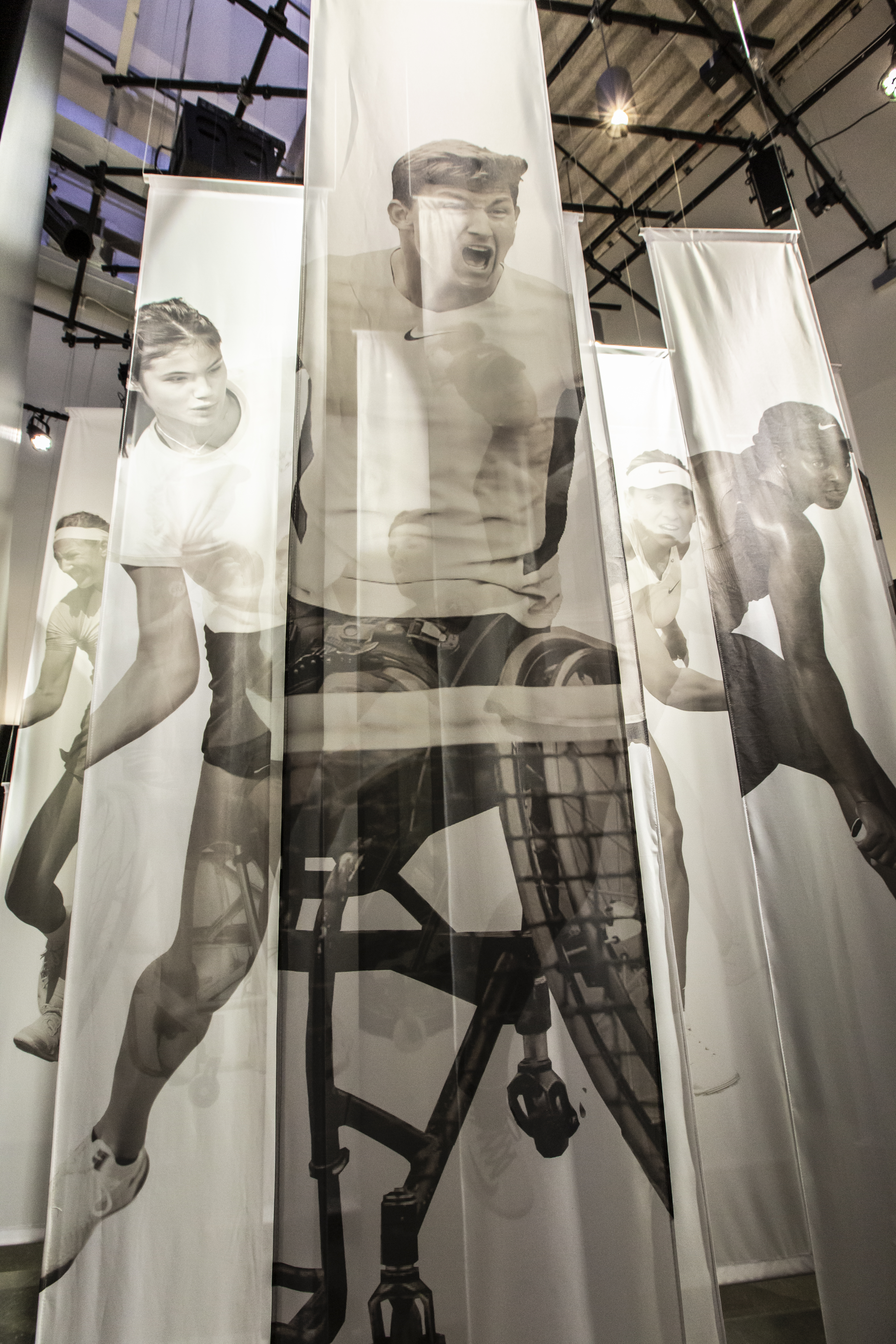
A collage-covered opening established the visual language at the transition into the space. Athlete photographs, footwear imagery, logos and signatures were arranged as a repeated grid, carrying the brand story across walls and around the opening. The contrast between image-rich surfaces and black partitions gave the environment distinct zones while preserving sightlines into the product display.
The NikeCourt mark acted as a recurring anchor across the installation, linking the graphic walls to the quieter areas beyond.


03 — Tennis Heritage as Graphic Storytelling
The archive wall placed dates, athlete moments, footwear and campaign imagery into a dense editorial composition. Large anniversary marks and headline-scale text created entry points into the smaller stories. Close-up views reveal the shifts in scale that let guests read the wall both as a bold brand surface and as a collection of individual references.
Nike’s 50th-anniversary imagery gave the installation a wider historical context. Rather than isolating the archive in a separate display, the graphics carried that history into the environment surrounding the guests.

04 — Product Presentation & Campaign Messaging
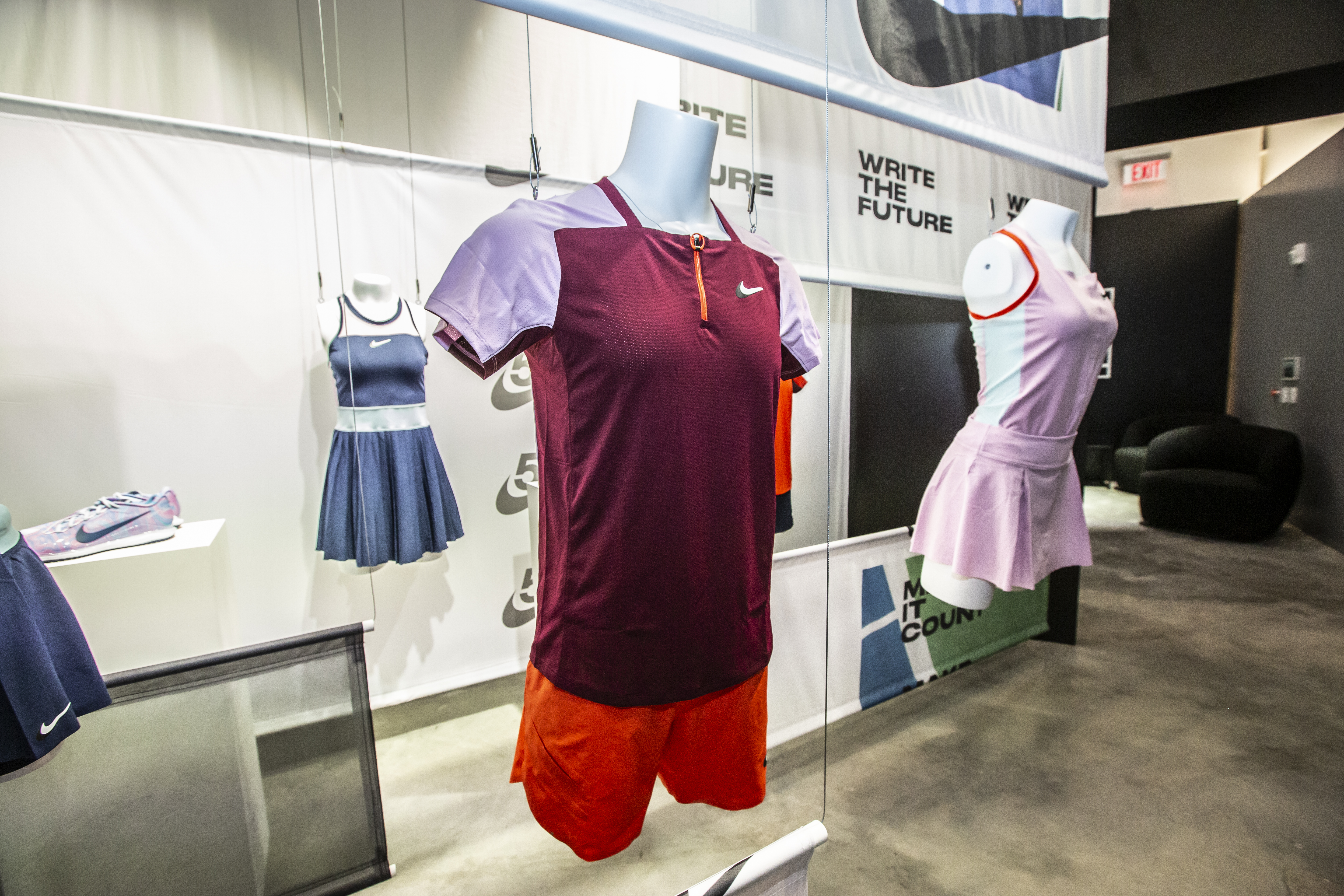
The apparel display brought the story back to the physical product. Mannequins and hanging garments were presented against translucent graphic panels, with oversized campaign typography visible above and below the clothing. The arrangement layered product, imagery and text without hiding the silhouettes or colors of the apparel.
A repeated rectangular framework connected this display to the collage walls. Different viewing distances served different purposes: a clear overall composition from across the room, followed by closer inspection of the garments and graphic details.


05 — Participation & the Completed Environment
The participation wall invited guests to add a personal message. Its black surface and white heading provided a simple framework, while the photographed installation shows colored handwritten notes and signatures making each contribution distinct. The idea connected the athletes represented in the archive to the people visiting the space.
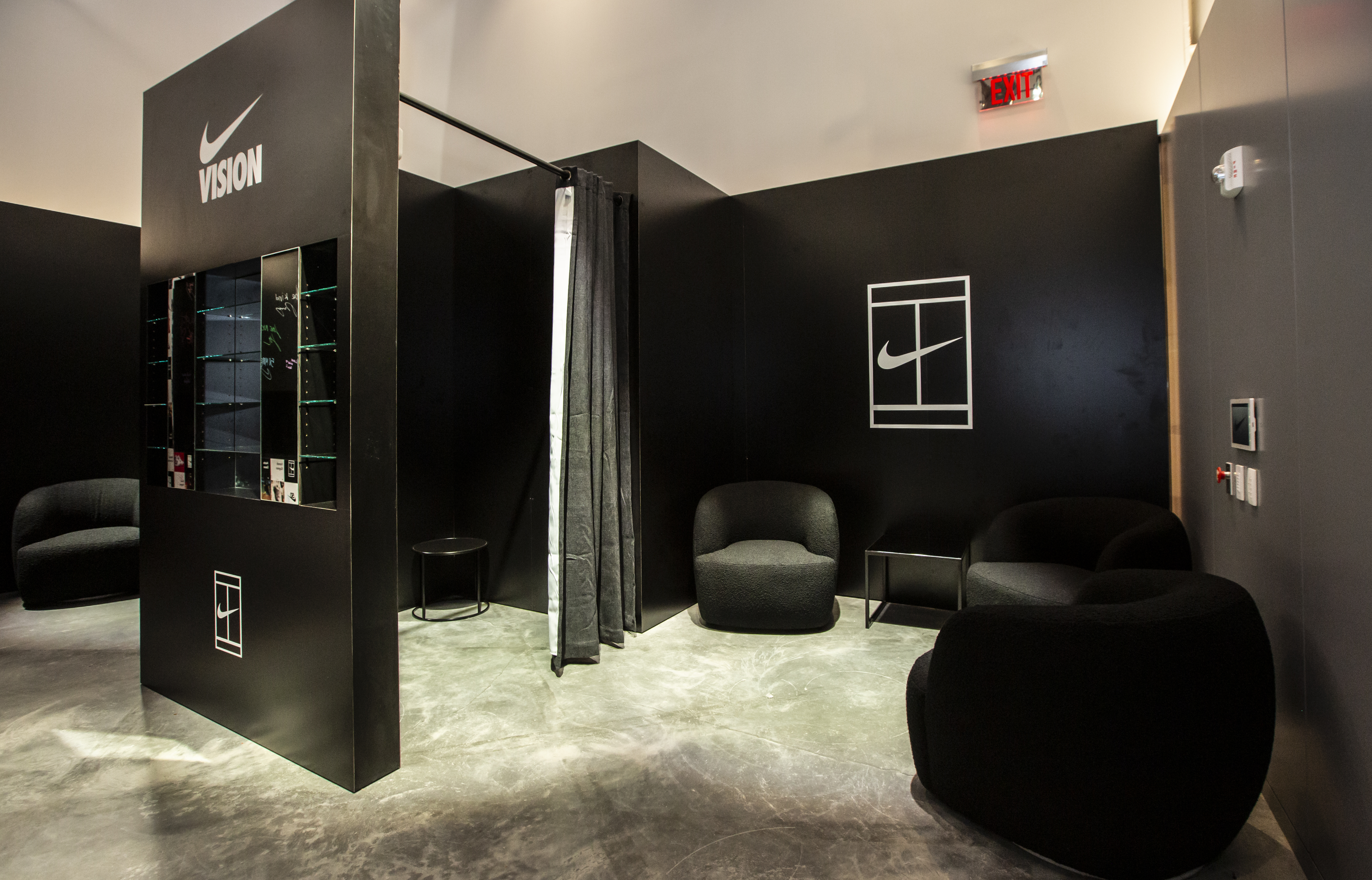
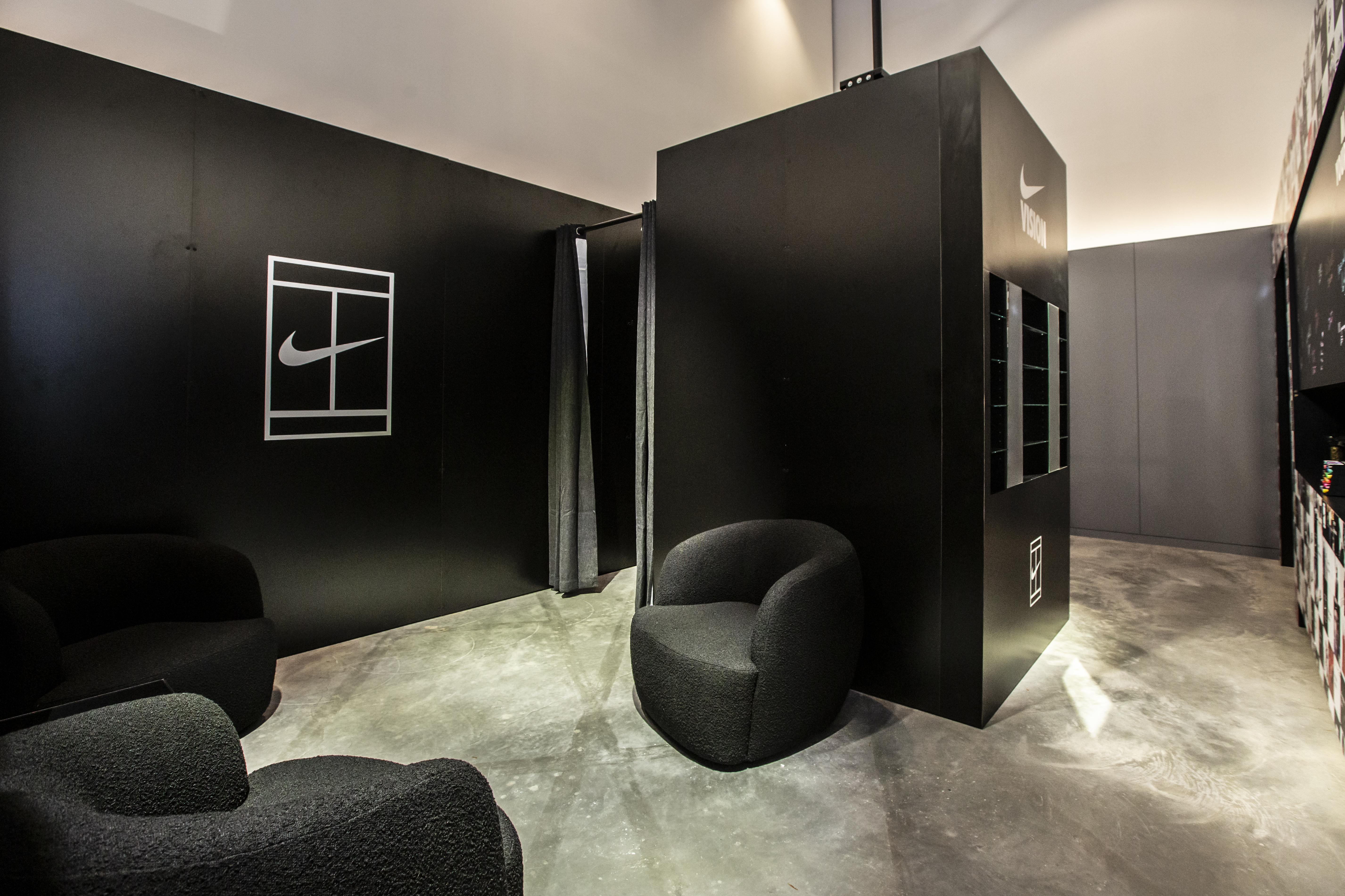
Nearby, seating and curtained areas created a quieter setting alongside the visual displays. Black partitions, restrained furniture and repeated NikeCourt marks kept these practical zones connected to the larger identity.
The completed installation demonstrates how graphic and spatial design can turn several brand stories into one coherent athlete environment. The photographs document the built space, its product presentation and the marks recorded on its interactive wall.

︎︎︎ VISUAL BRANDING:
- lululemon — Dupe Swap Activation
- LA Lantern Art Expo 2024
- lululemon — Chargefeel Launch
- Nike — US Open 2022 Activation
︎︎︎ EDITORIAL:
- Adidas Crazy One
- JP Morgan Chase SC
- Kawabata Yasunari
- Mirror, Reflection of Society
- Naked Lunch Specimen
- ACCD Film Club
- Big Data Isolation
︎︎︎ MOTION:
︎︎︎ PM STUDIO — INDEPENDENT WORK:
- UNMATURE LA — Streetwear Brand
- Real Estate — Photography & Videography
- Aegis Biopharmaceuticals — Brand Design
- Hydun Petcare — Brand Identity
- Visual Explorations
- Custom Sneakers — Art & Design
︎︎︎ COOL&FUN:
︎︎︎ CLIENTS:
- adidas
- Amazon
- Apex Global Groups
- Apple
- Berkshire Hathaway
- Call of Duty
- JPMorgan Chase
- lululemon
- Mico Tequila
- Nike
- Starry
Email: hzhangdesign@gmail.com
Phone: 858.740.9135
Instagram: pmstudiola
©2015 QS Studio llc All Rights Reserved