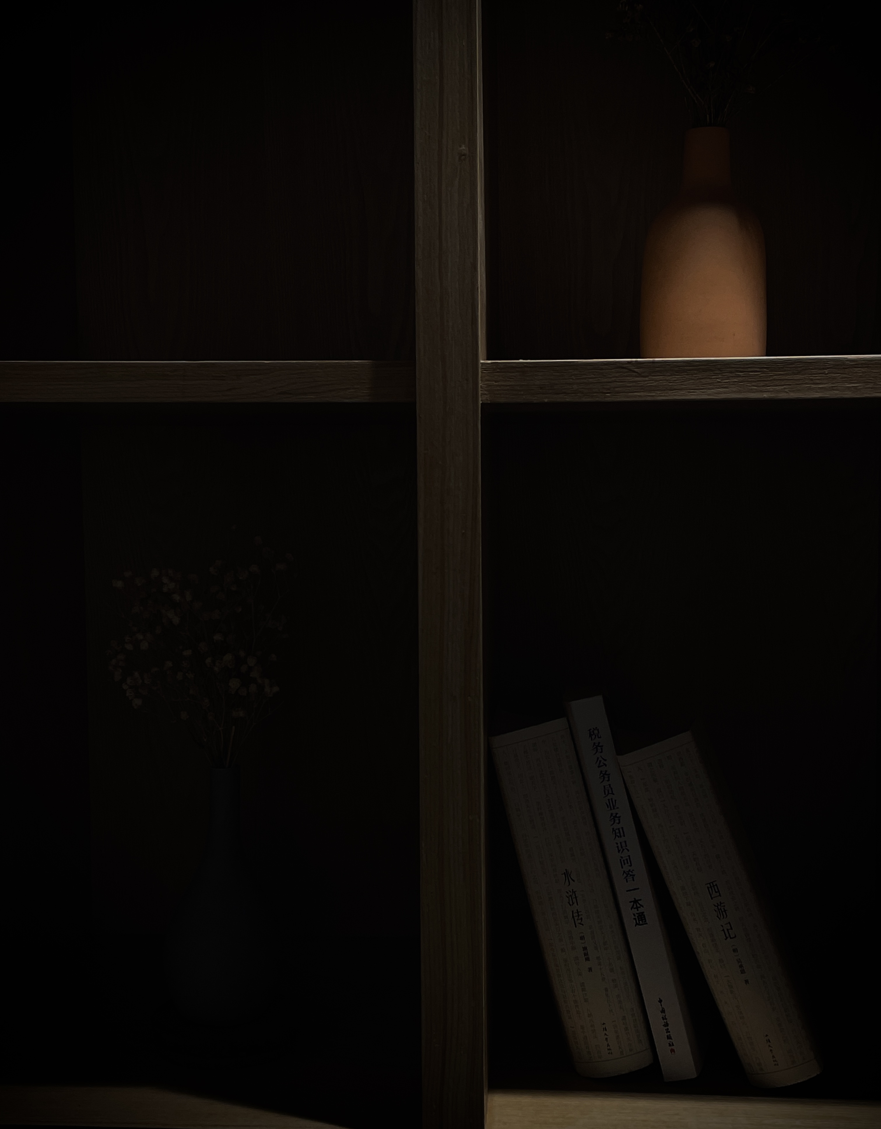
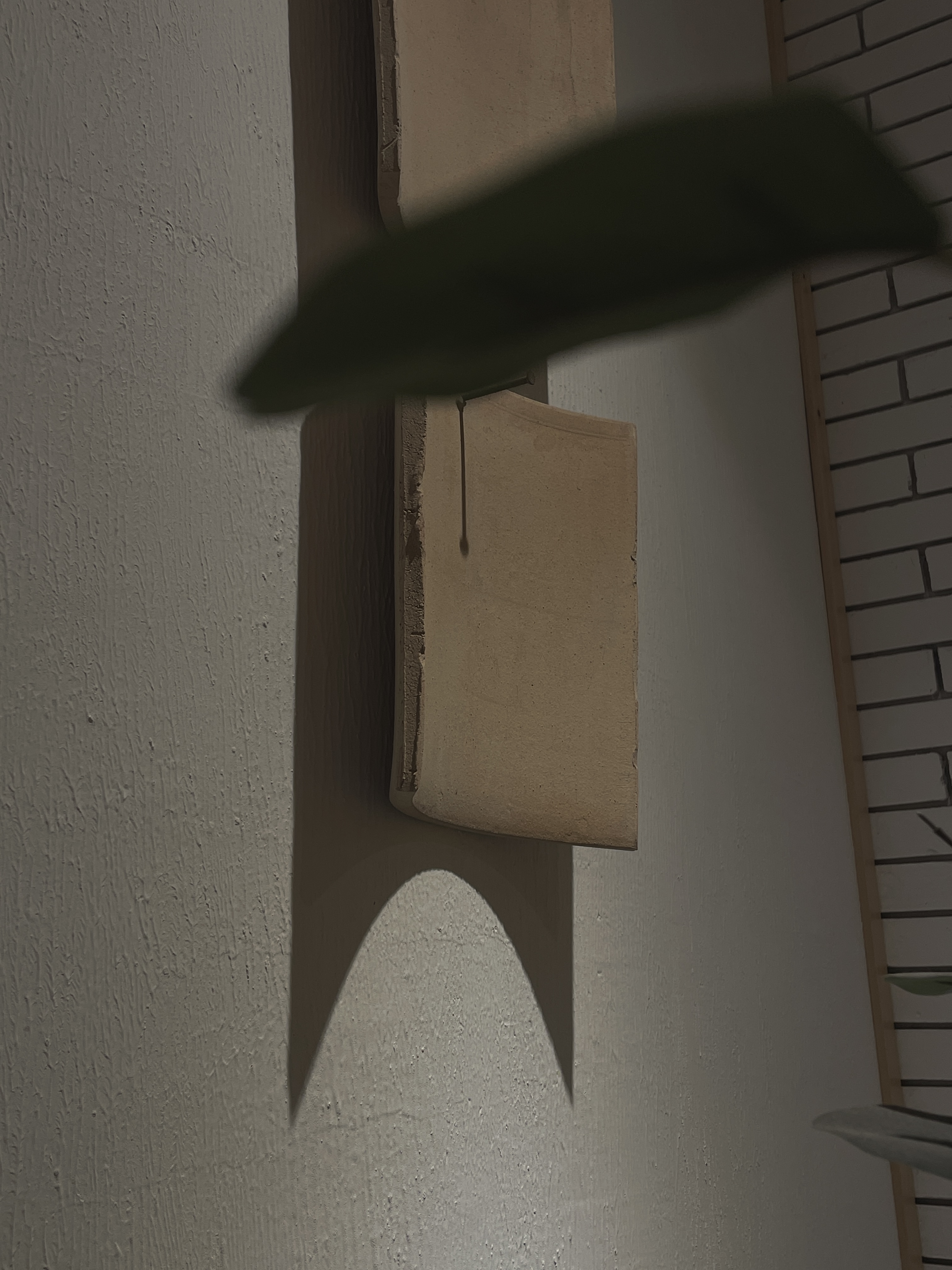
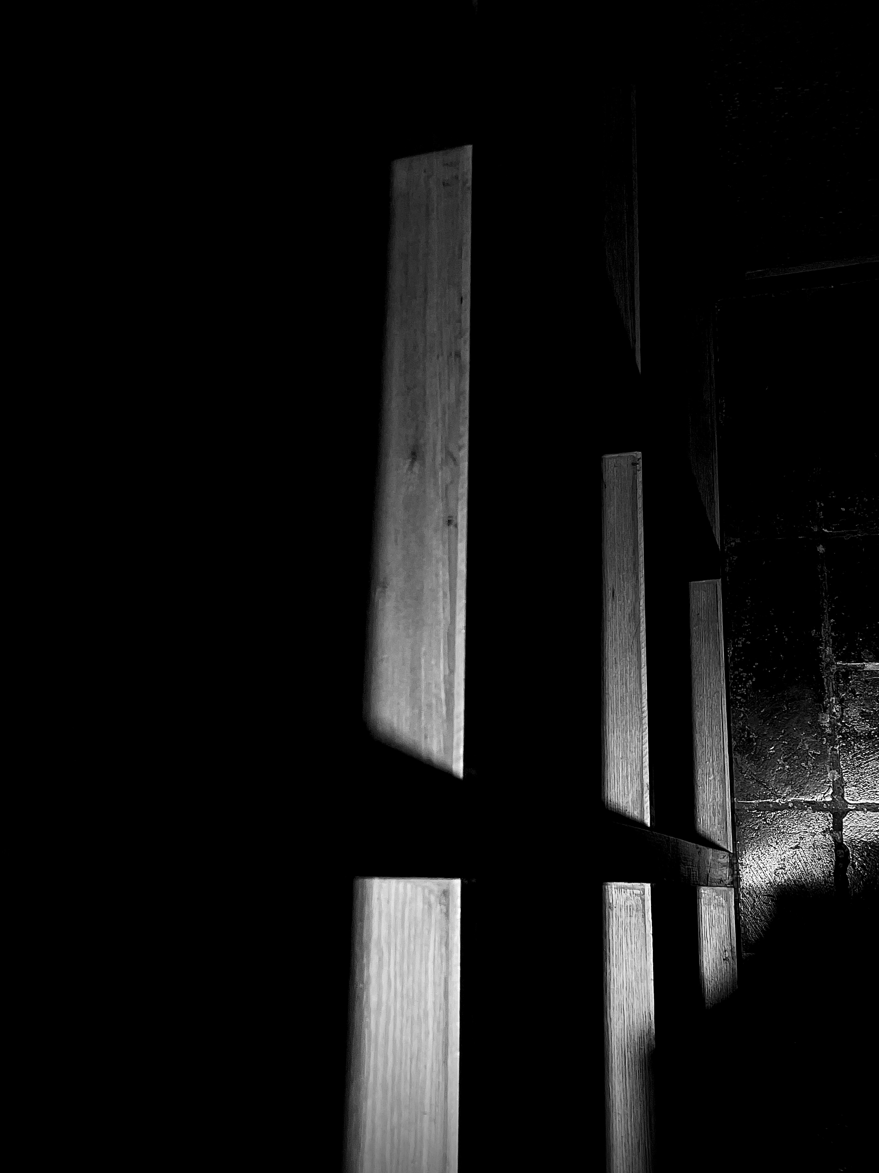
Independent explorations across poster design, photography and film. The collection brings together visual storytelling, typographic experiments and observations of everyday life.
01 / Posters
City After Hours
Personal poster series · Five scenes · Bilingual typography
City After Hours imagines the city after the working day ends: a place for music, late food, flowers, wandering and a drink with friends. Animal characters bring a playful, slightly surreal presence to familiar urban settings, making each scene feel like a small story rather than a conventional nightlife advertisement.
Visual direction
The images use a retro flash-photography aesthetic: direct light, textured walls, wet pavement and saturated red, green and blue. These tactile details give the series an immediate, lived-in atmosphere while the oversized animal figures introduce humor and warmth.
One system, five stories
Large Chinese headlines set the emotional tone; concise English lines invite the viewer into each scene. Cream typography, a crescent motif and repeated corner text connect the posters. The composition adapts to the subject and open space in each image while preserving a recognizable family.
01 / Late-Night Frequency A record-store scene turns listening into a shared late-night ritual.02 / Late Bites A small bowl of food becomes a gesture of warmth and hospitality.03 / Flowers Tonight Fresh flowers bring a moment of tenderness to the night walk.04 / Until First Light A quiet street and blue sky stretch the journey toward morning.05 / After Work A raised glass marks the shift from work to time shared with friends.
Hello, School!
Personal poster exploration · Six designs · Back to kindergarten
Hello, School! reimagines the return to kindergarten as an invitation to play, explore and make new friends. Six familiar objects become the heroes of a welcoming poster series, turning everyday school essentials into symbols of curiosity and possibility.
Visual idea
Enlarged object imagery, paper textures and bold black lettering create a tactile collage language. Loose arrows, stars and hand-drawn messages echo the spontaneity of a child's sketchbook, giving the compositions an energetic, approachable voice.
One system, six personalities
The repeated “Hello, School!” headline and short prompts—“Let's play,” “Stay curious” and “Grow together”—hold the series together. Each object introduces a different color pairing and composition while maintaining the same optimistic message.
01 / Backpack — Ready for a New Start An orange backpack against cobalt blue makes the first-day ritual feel bold and welcoming.02 / Crayons — Make Room for Color Purple and lime crayons turn creative tools into a bright invitation to experiment.03 / Pencil — Start with a Mark An oversized turquoise pencil gives a small everyday object the energy of a graphic centerpiece.04 / Sneaker — Step into Play A worn canvas sneaker connects movement, discovery and the freedom to play.05 / Bottle — Everyday Adventures A blue bottle brings a familiar daily essential into the same playful visual language.06 / Sketchbook — A Place for Ideas A sketchbook carries the headline itself, making the space for drawing part of the message.
02 / Photo
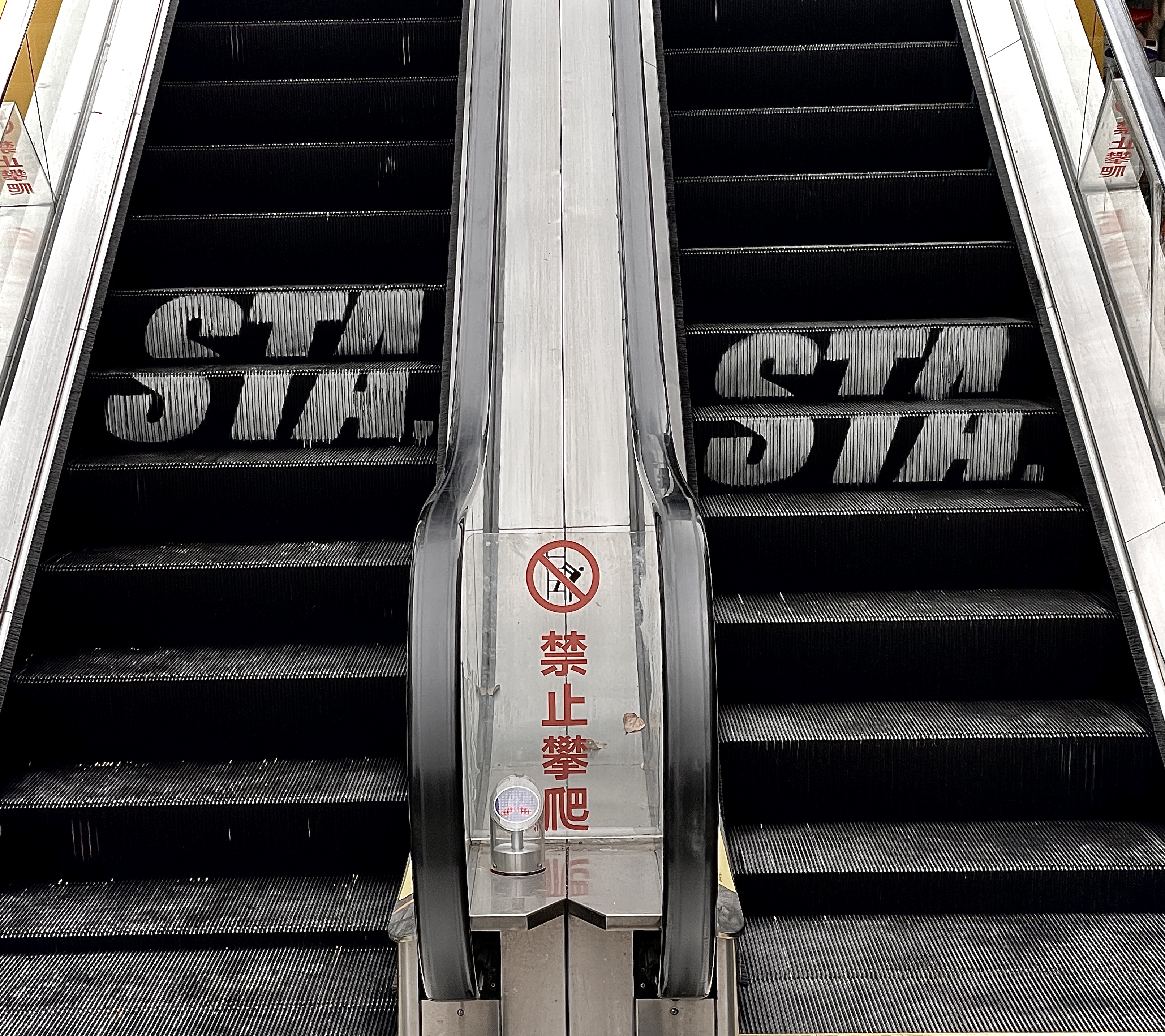
Color & Graphic Form
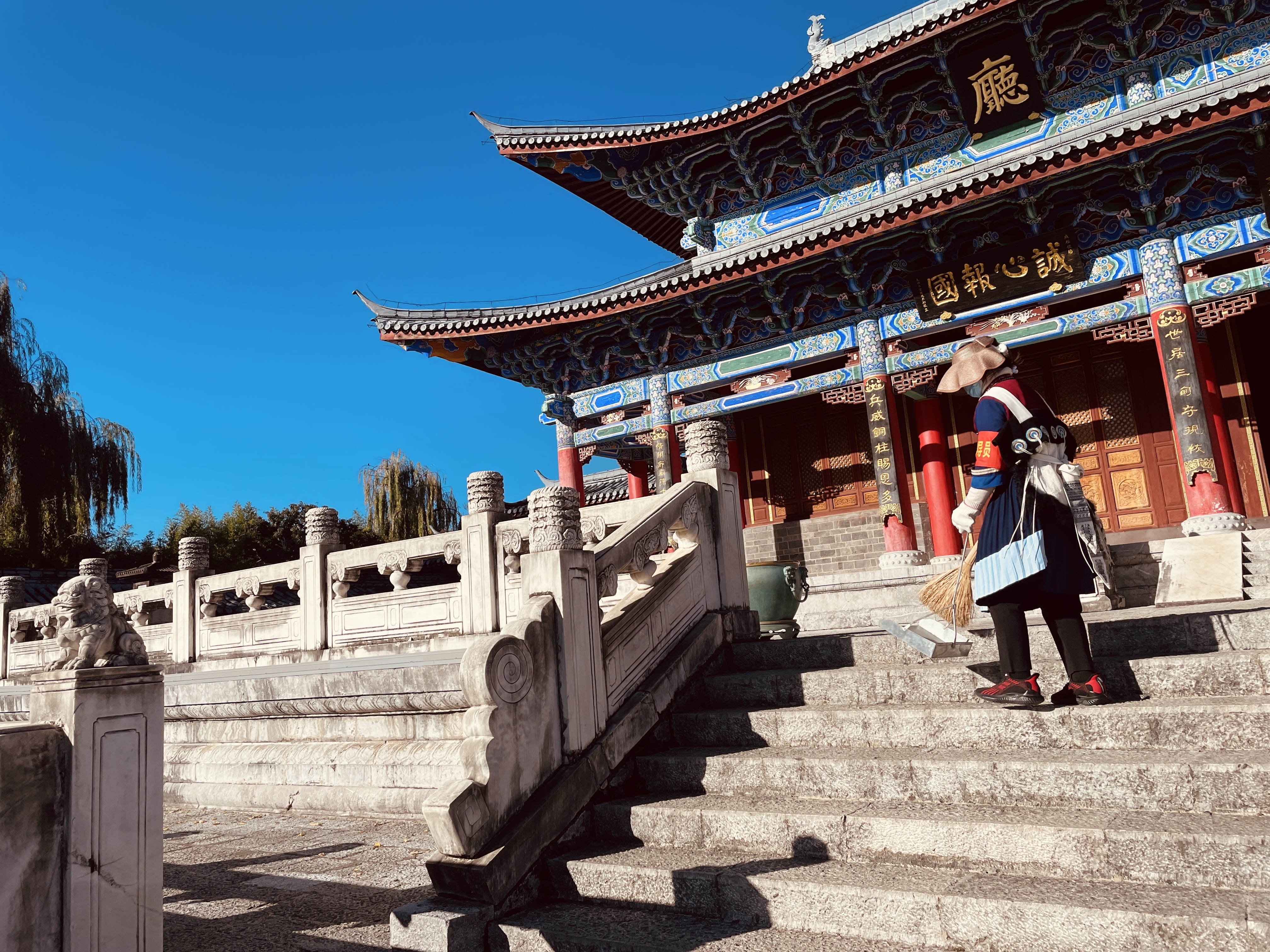
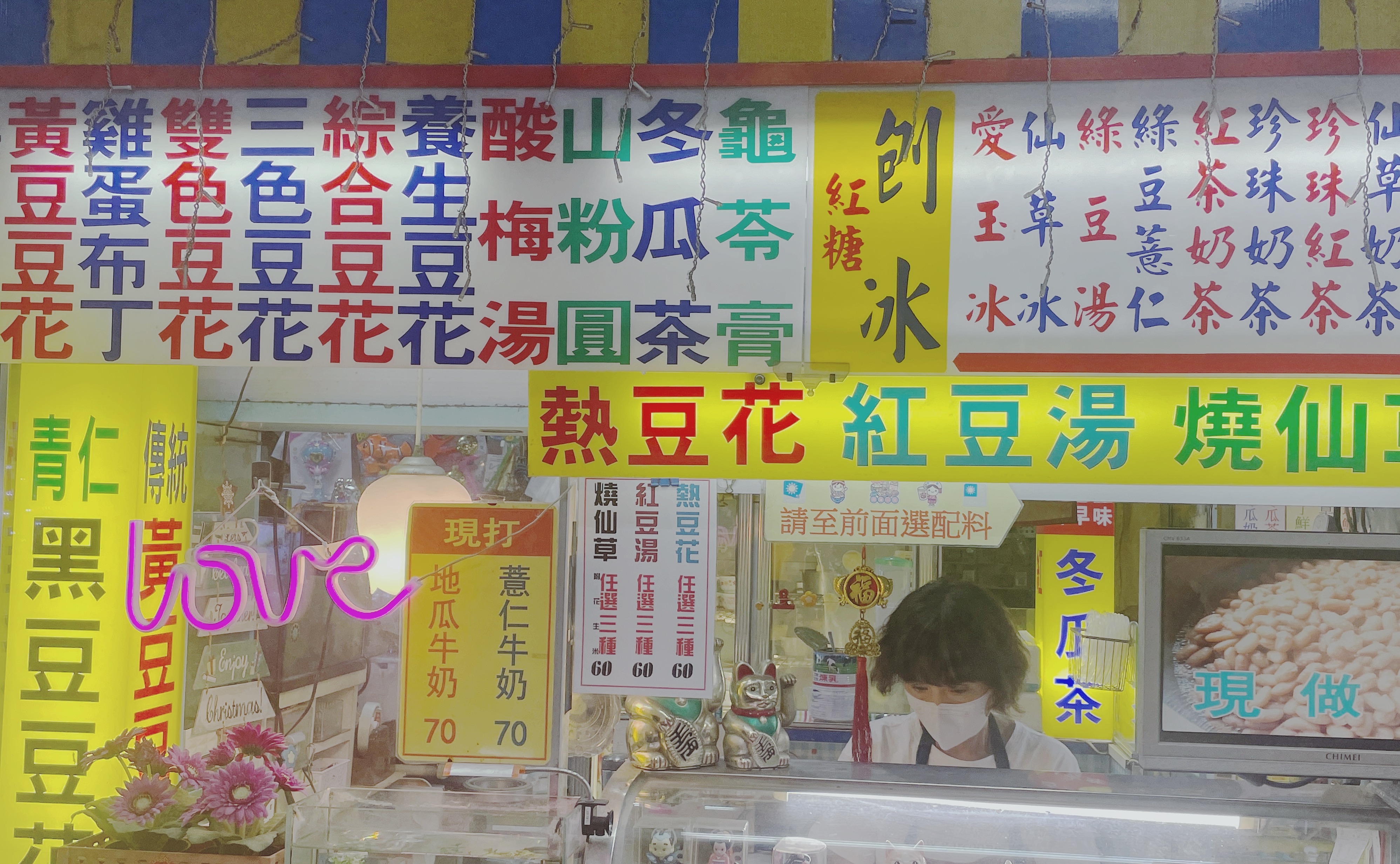
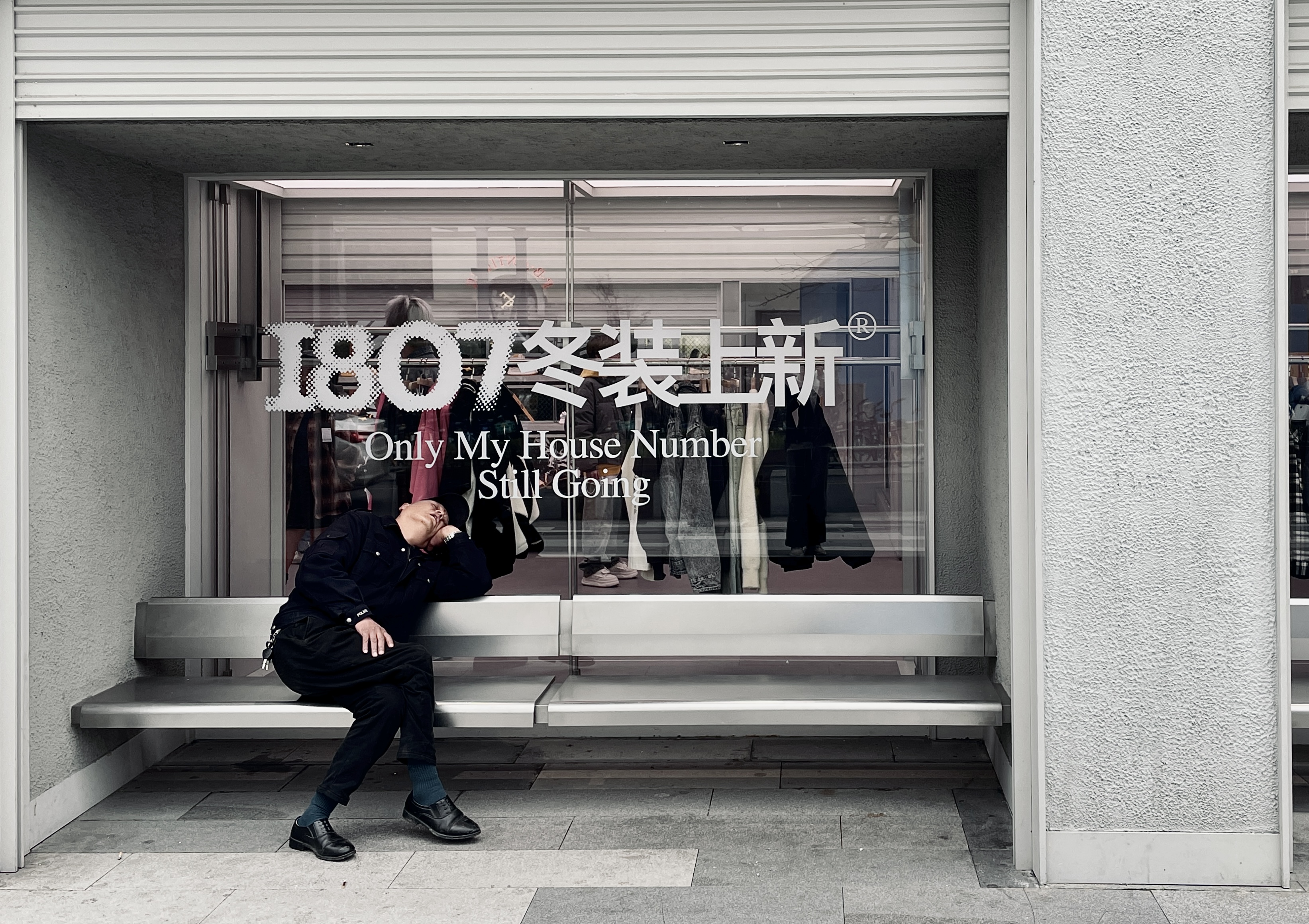
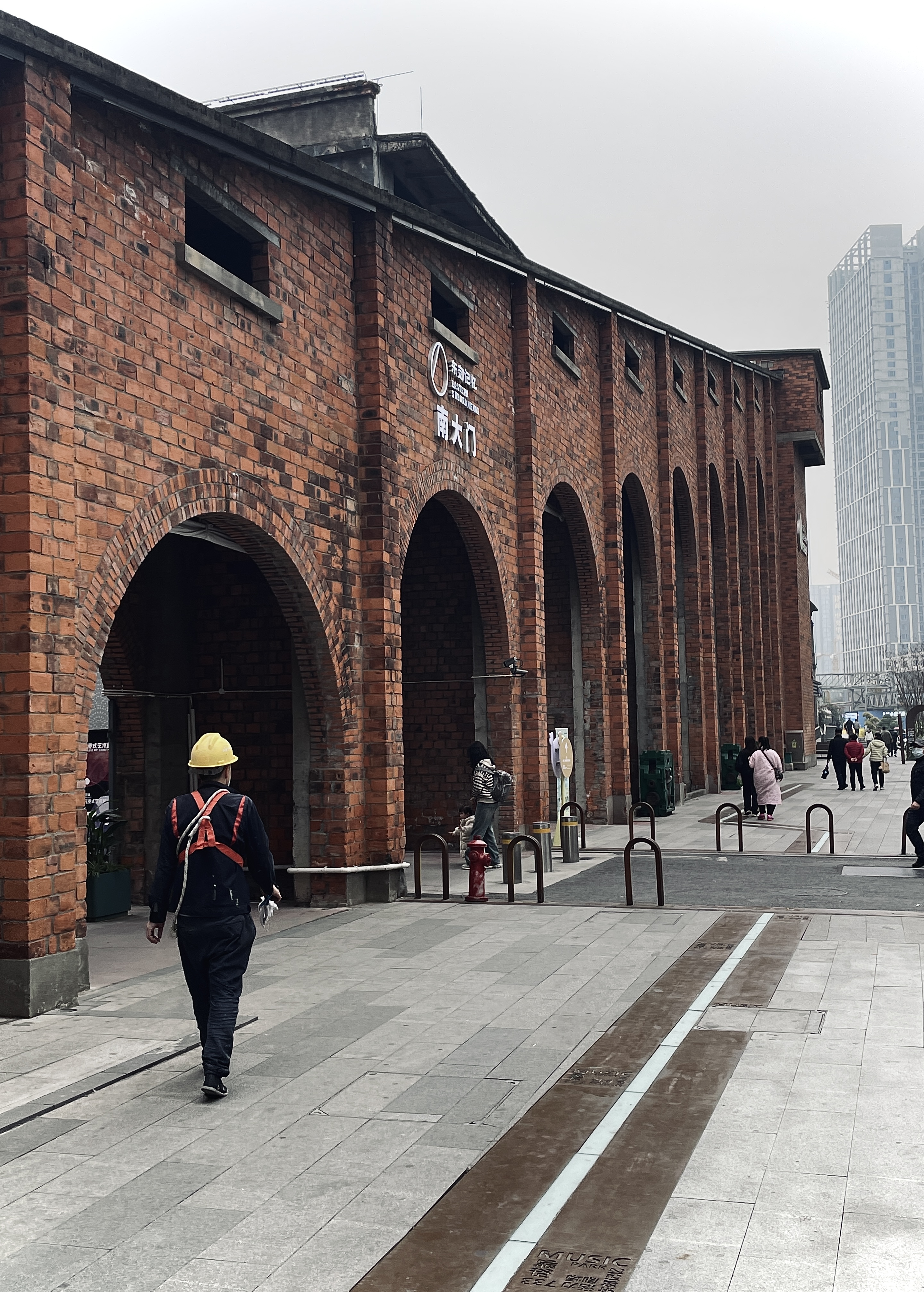
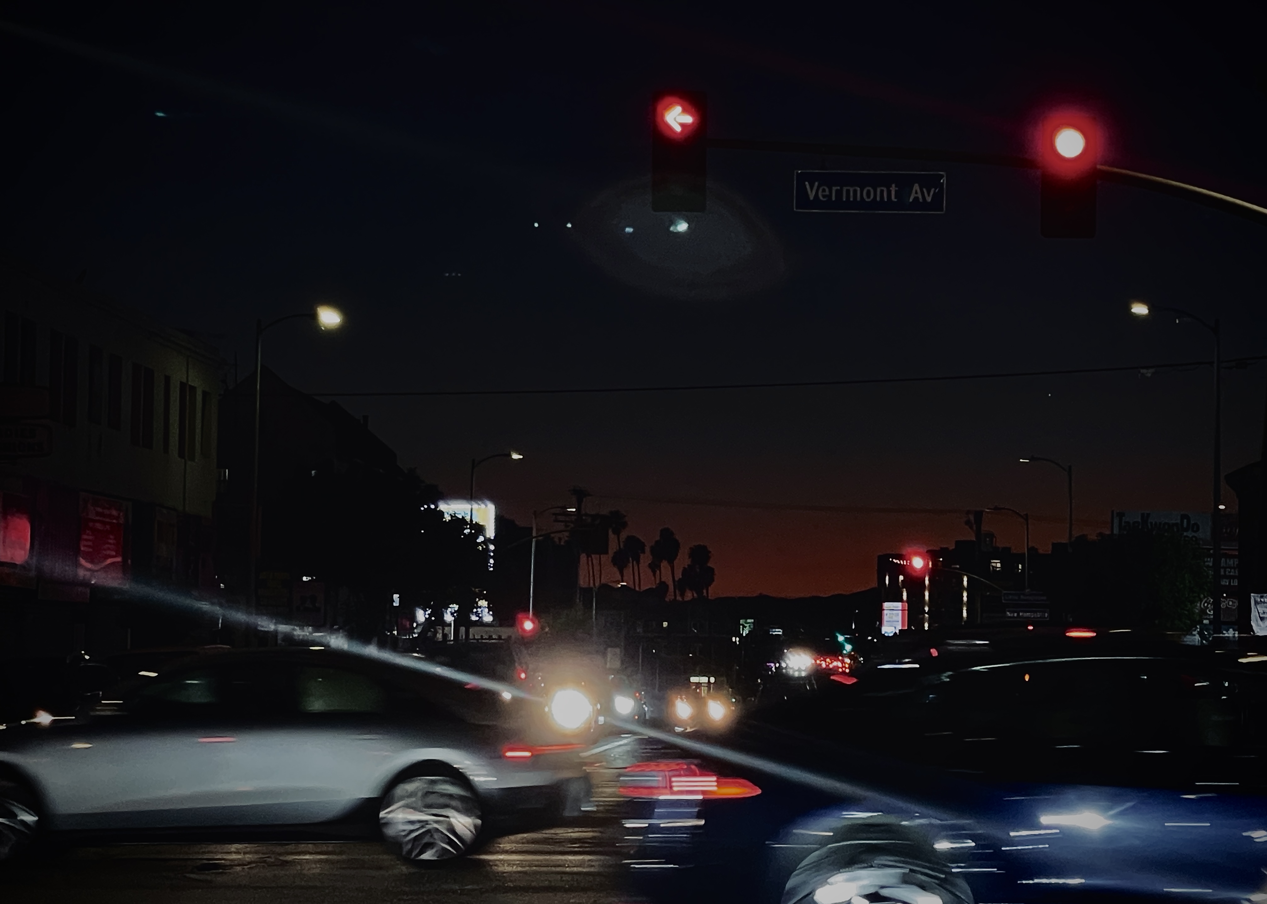
Street Observations
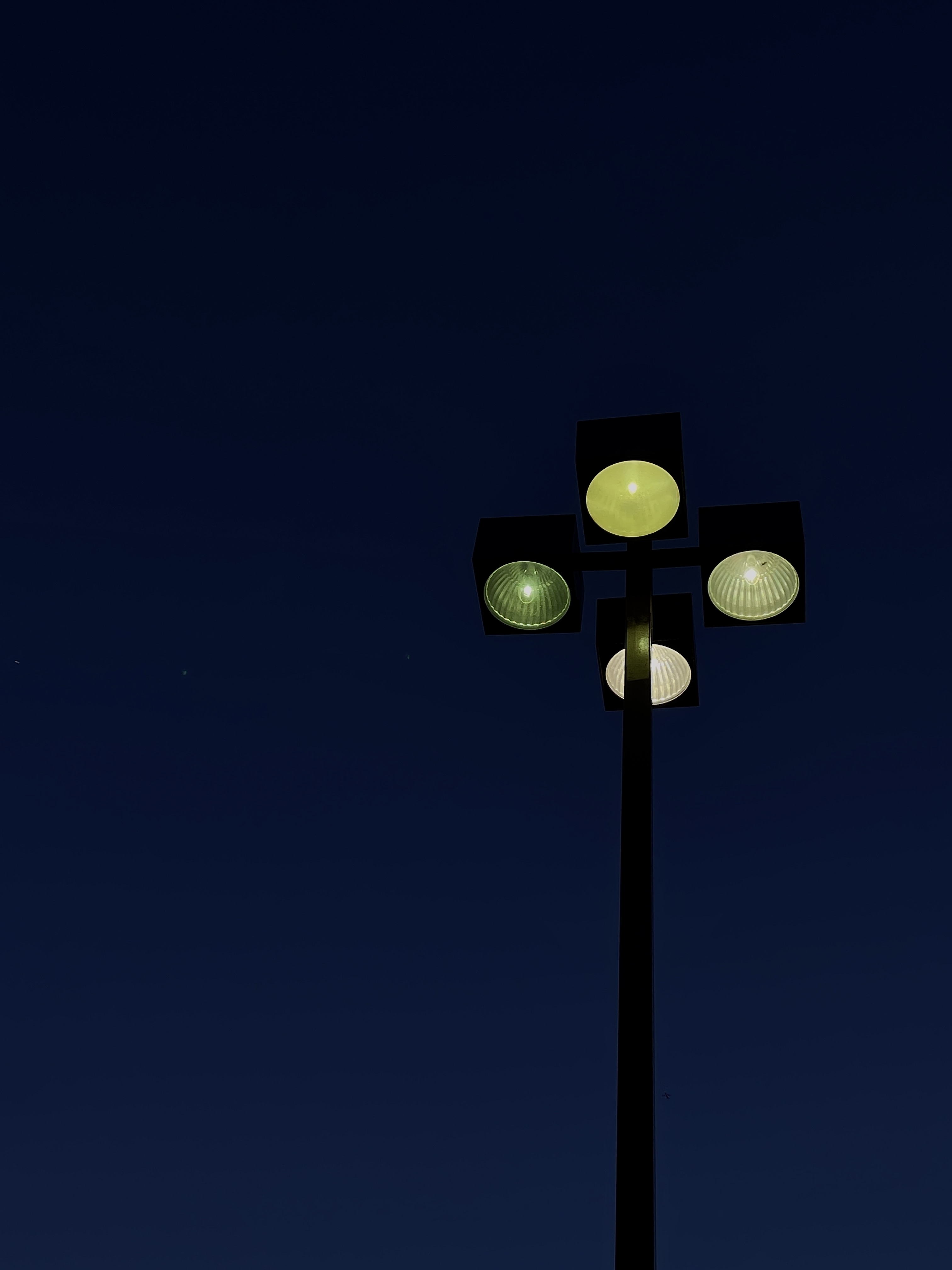
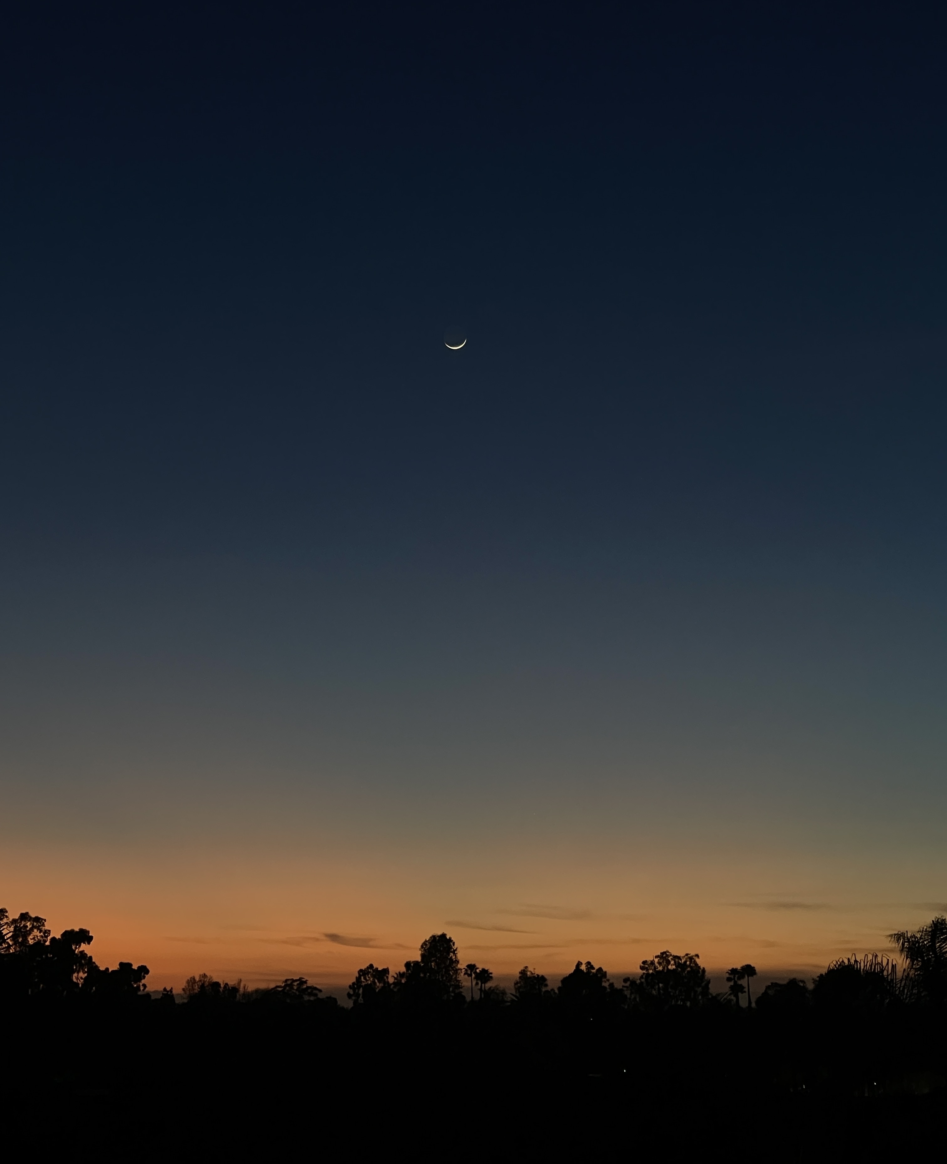
Light, Shadow & Night
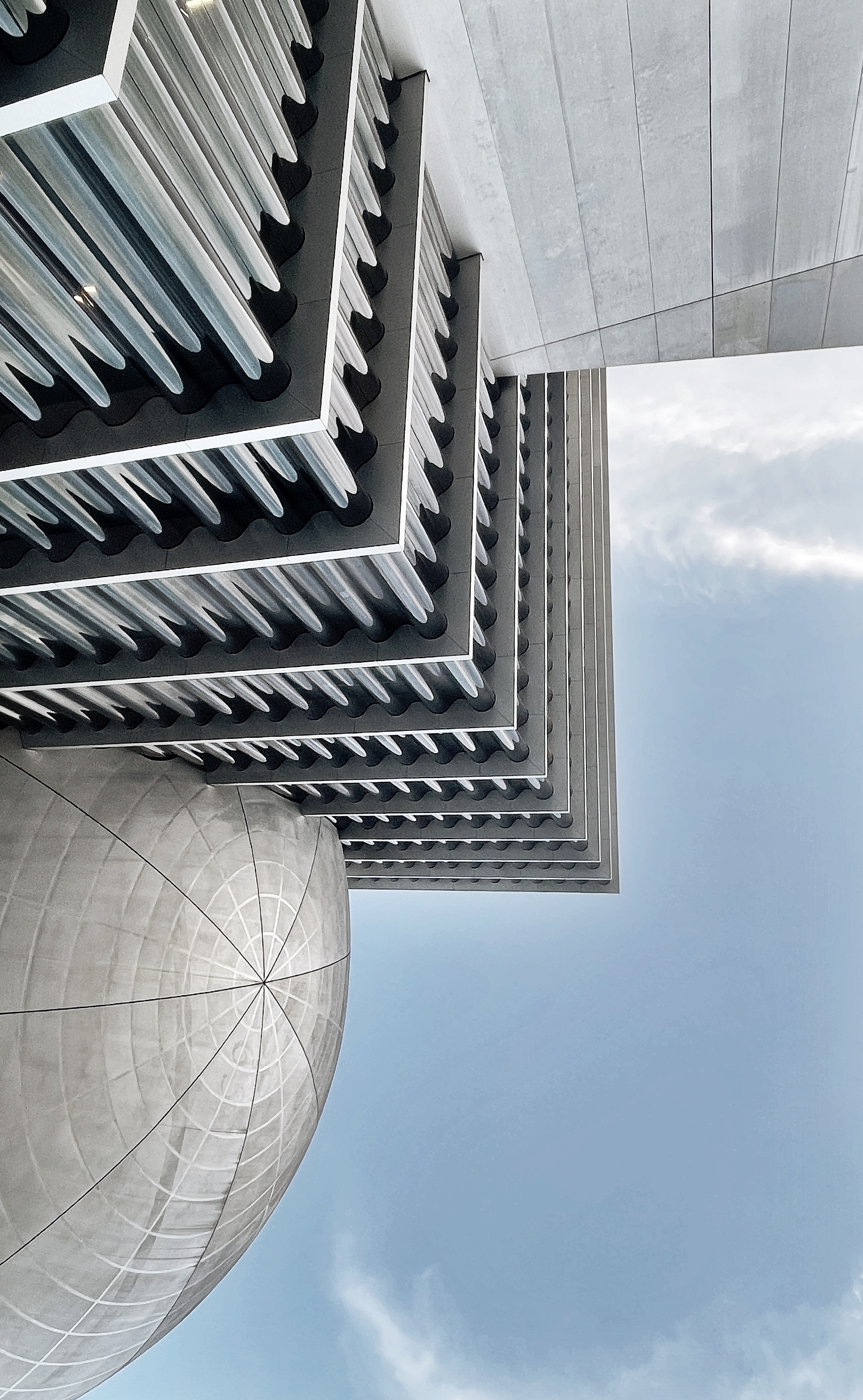
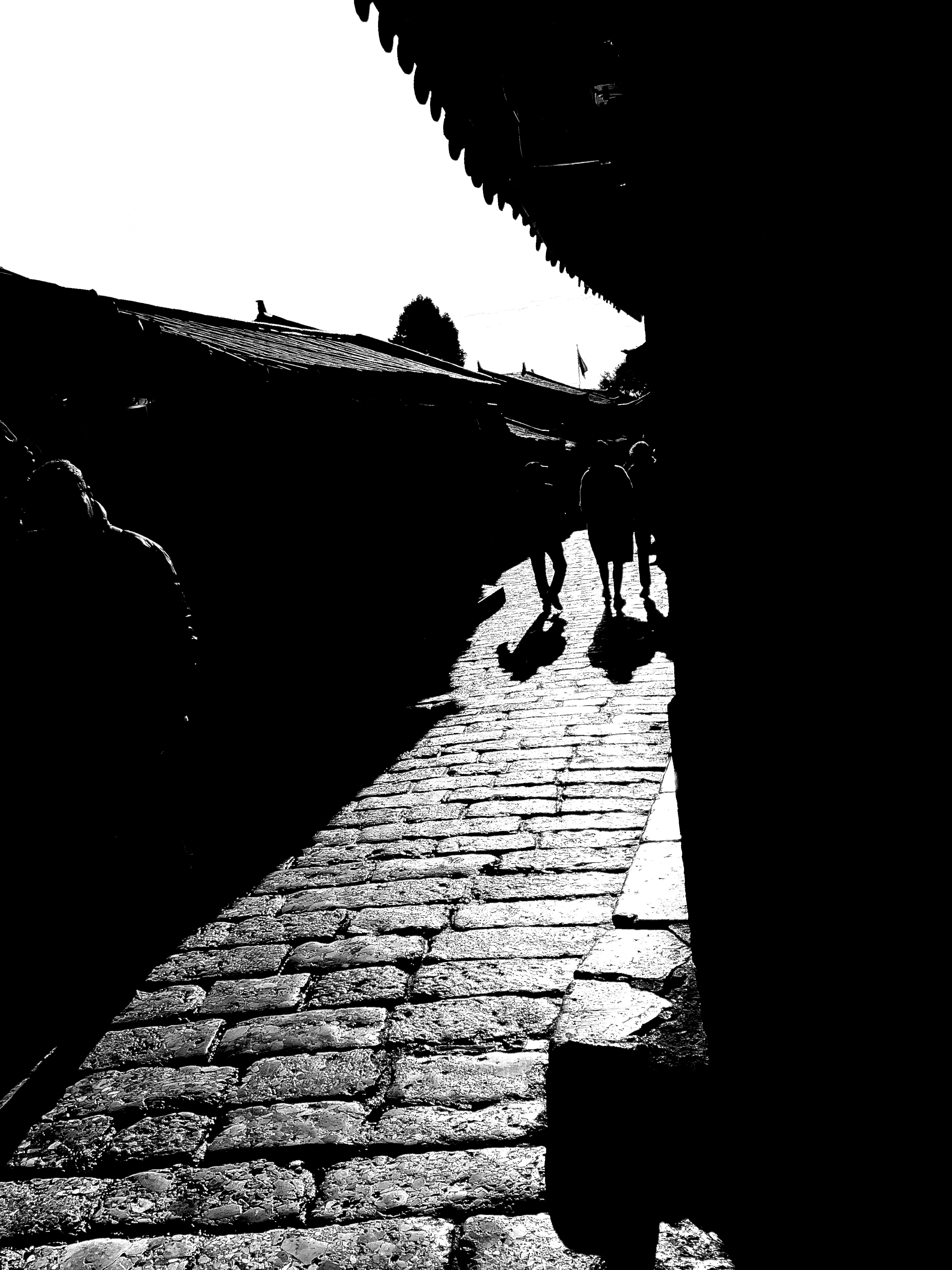
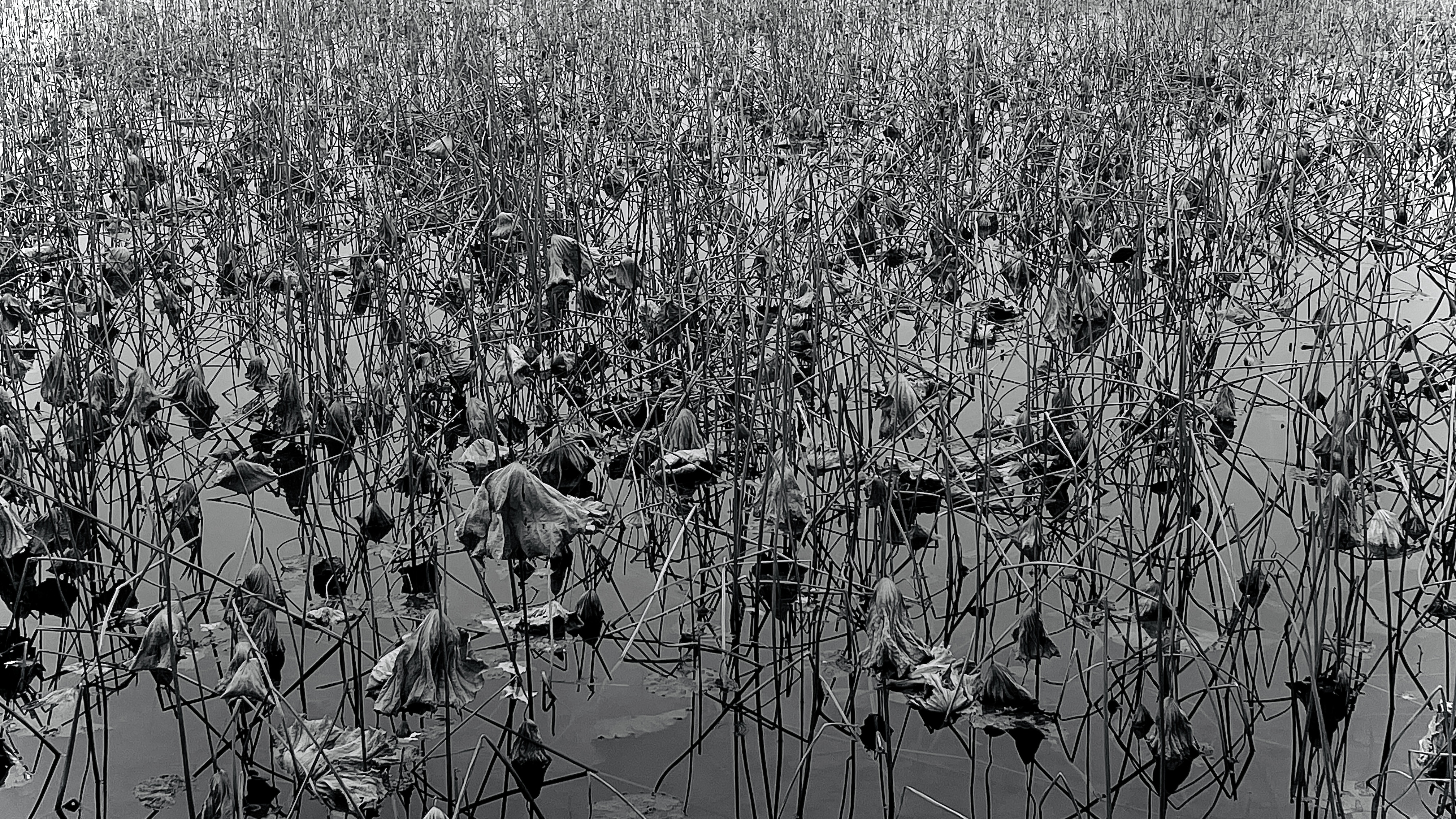
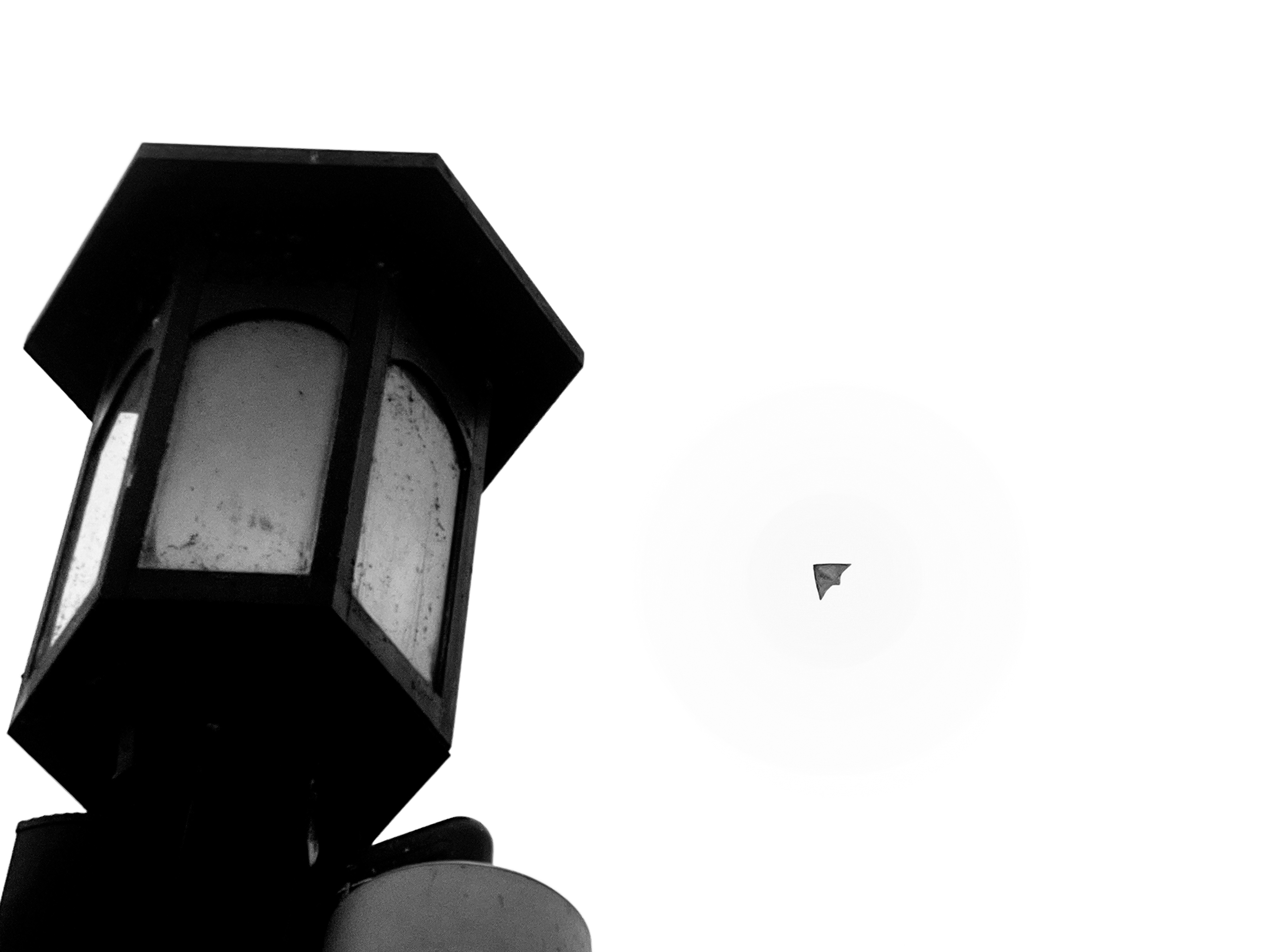
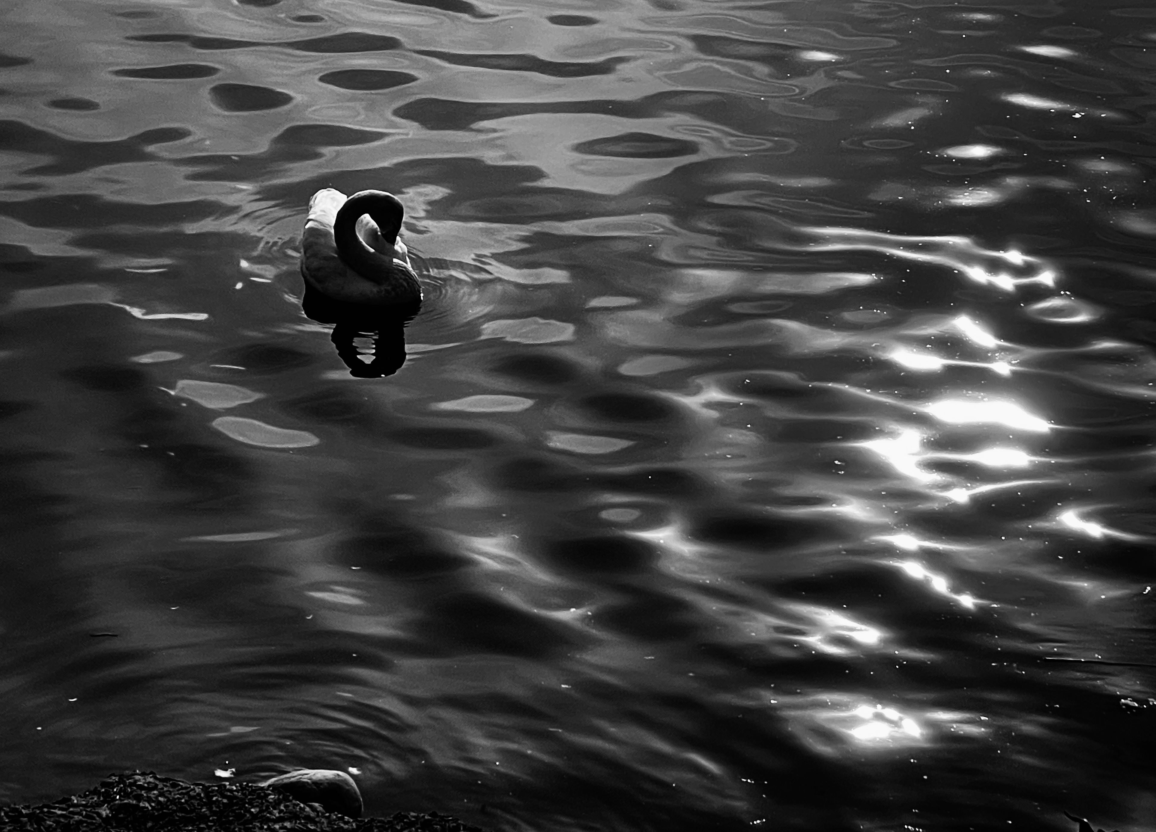
Monochrome Studies
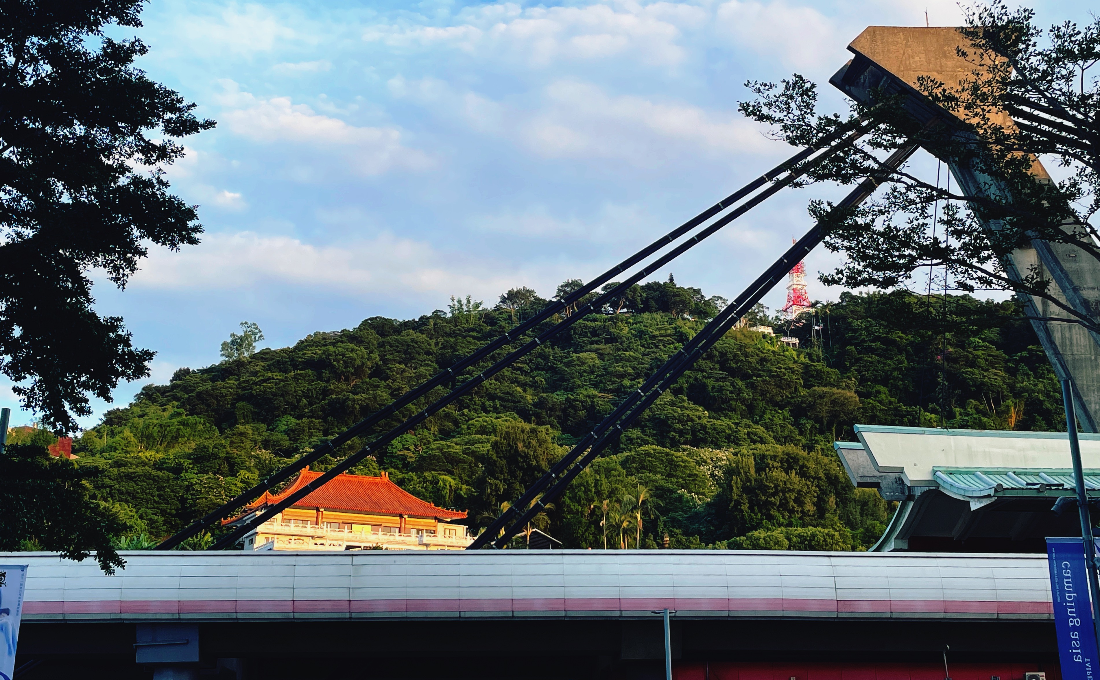
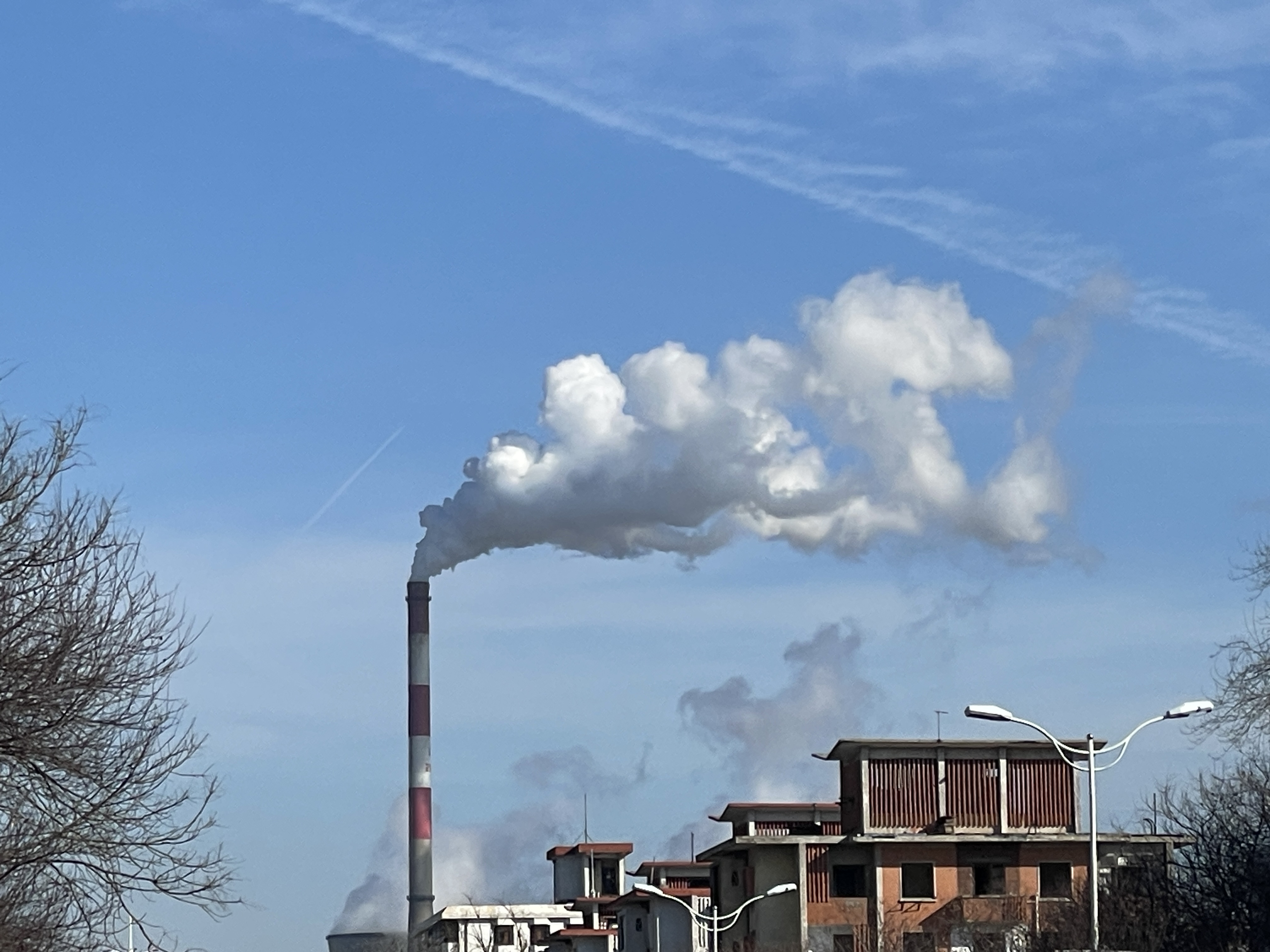
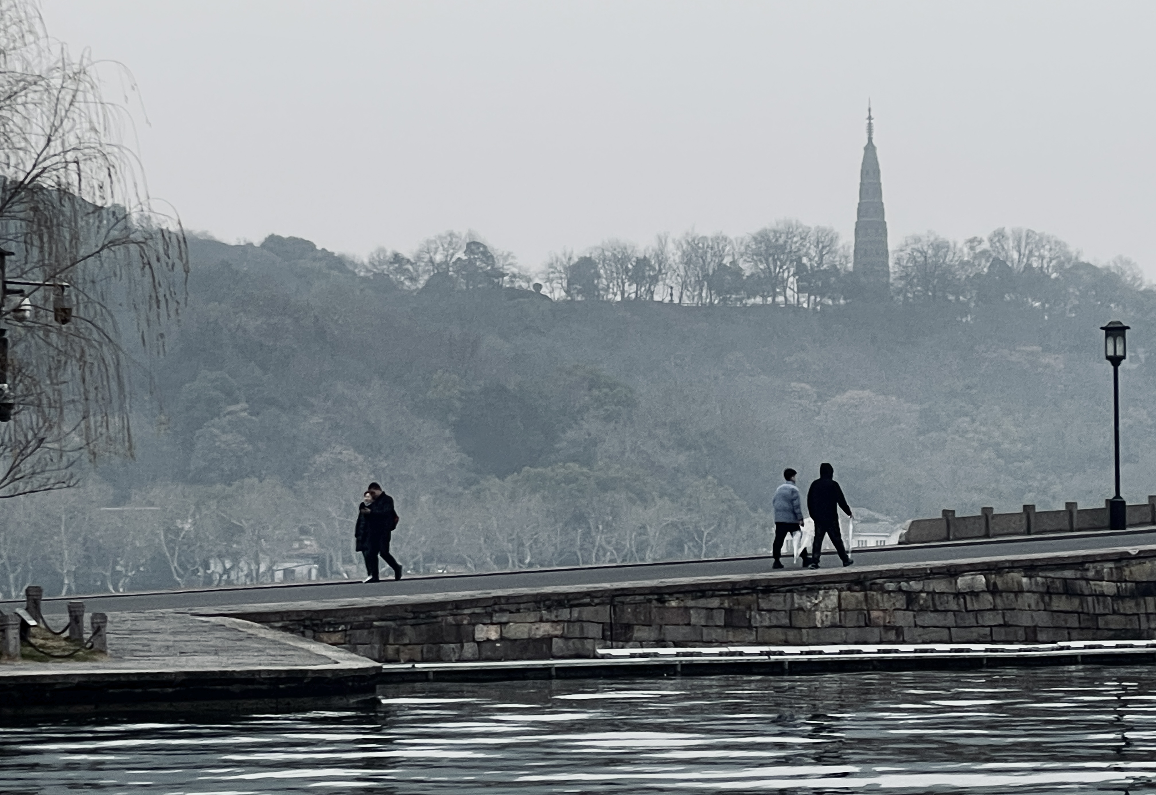
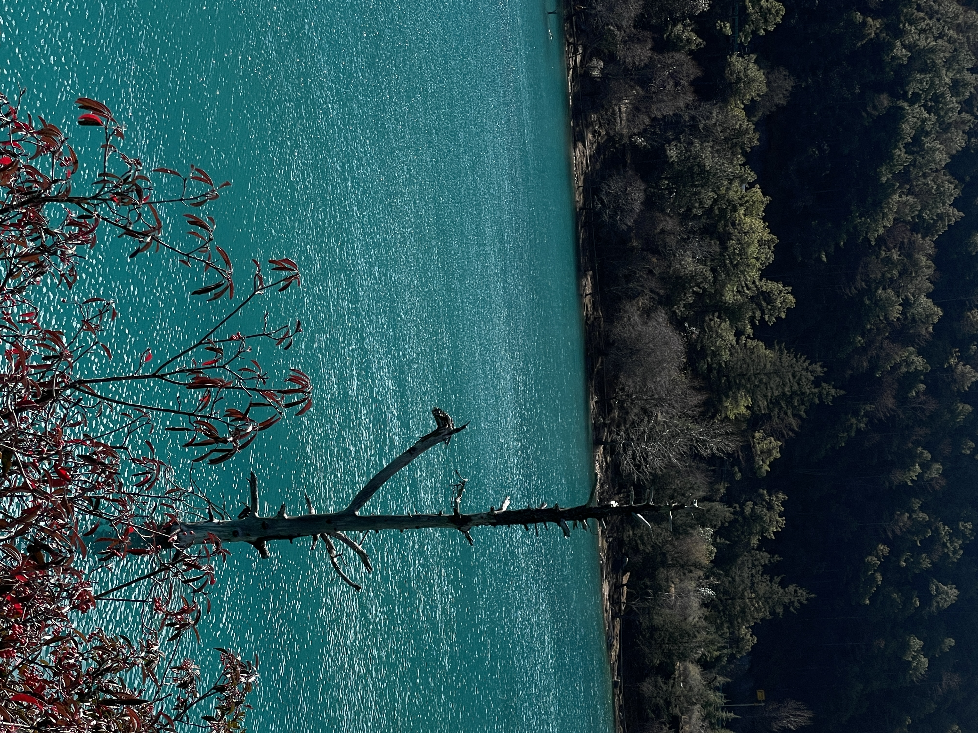
Landscape & Atmosphere
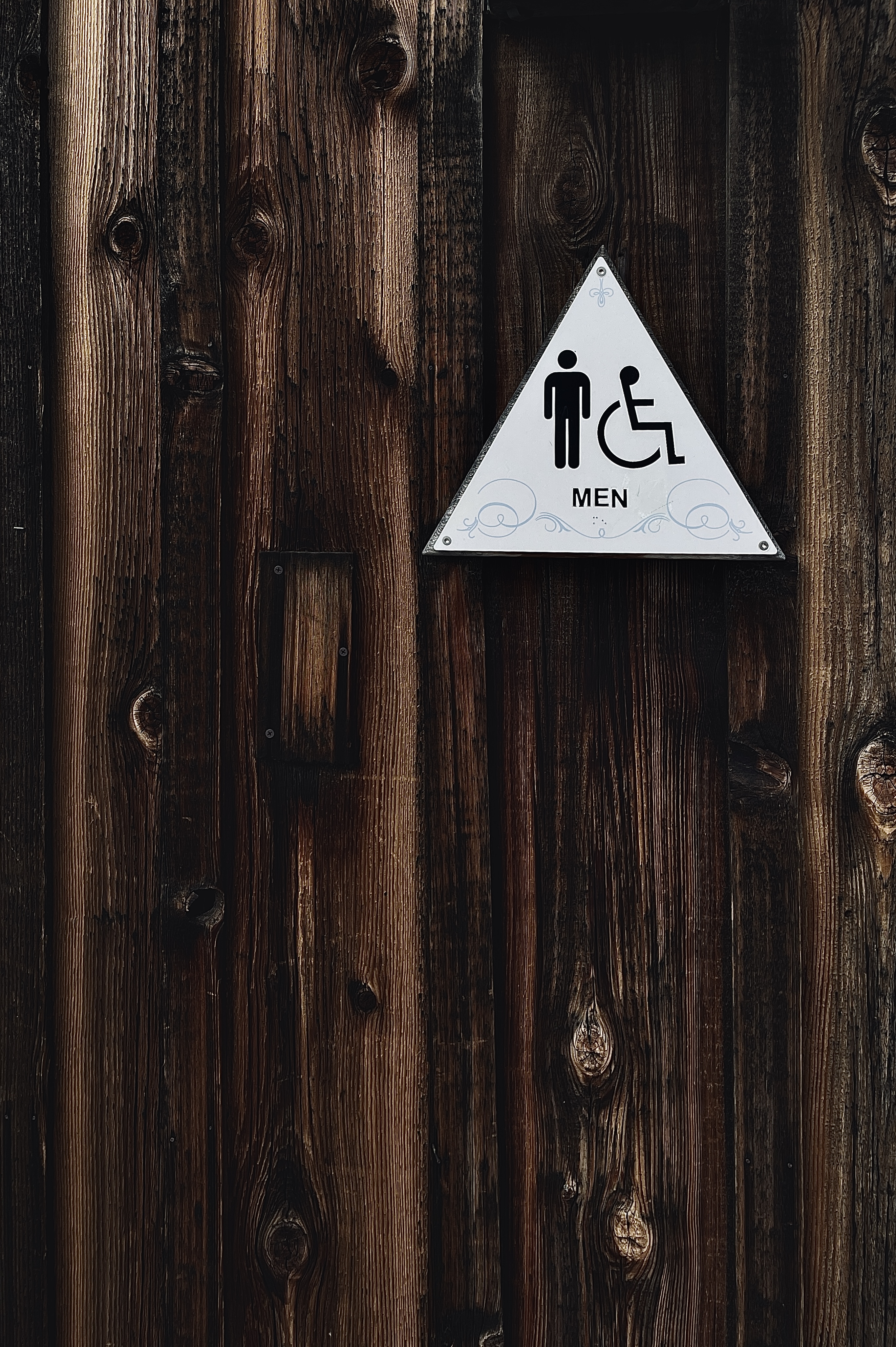
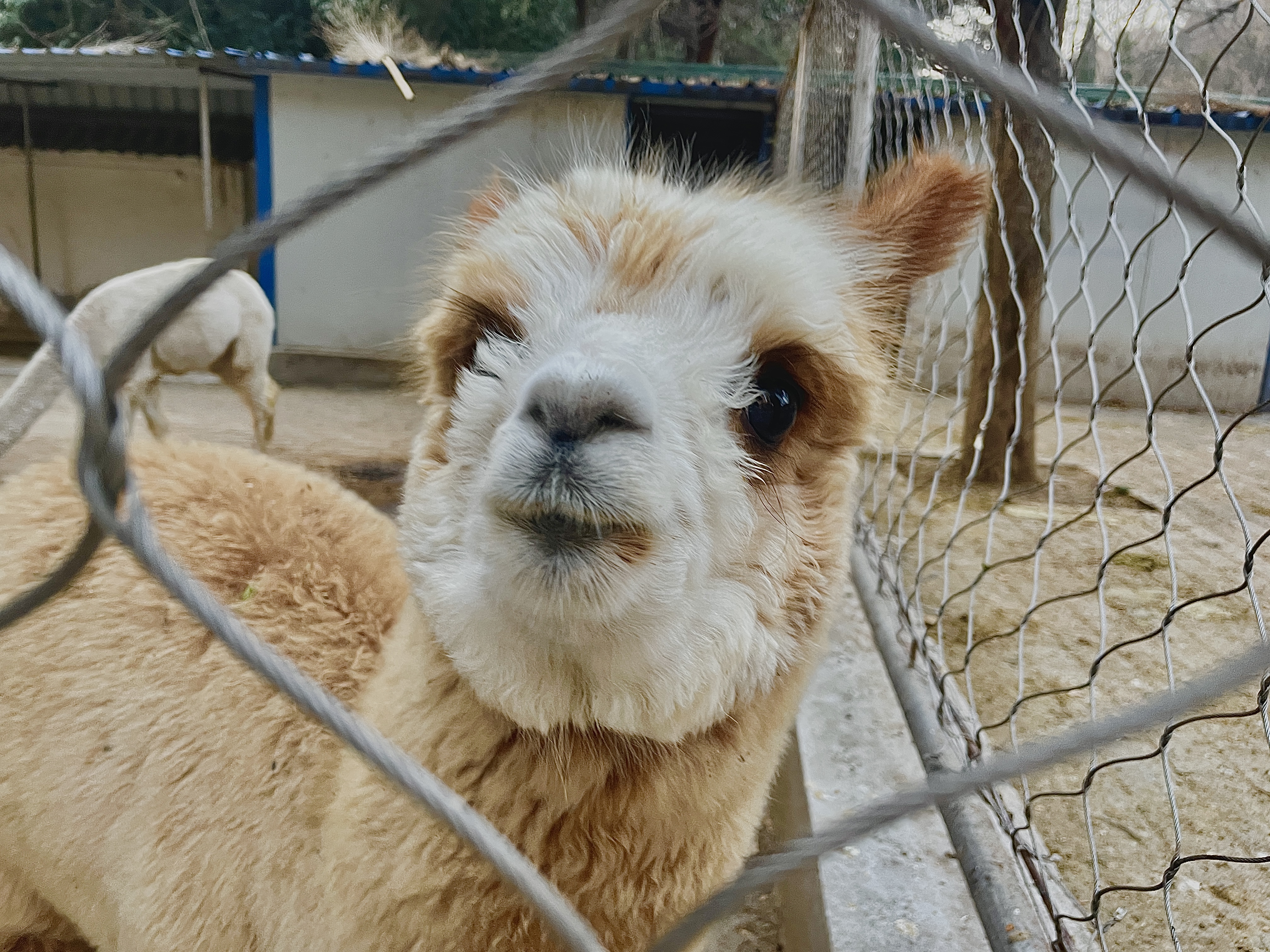
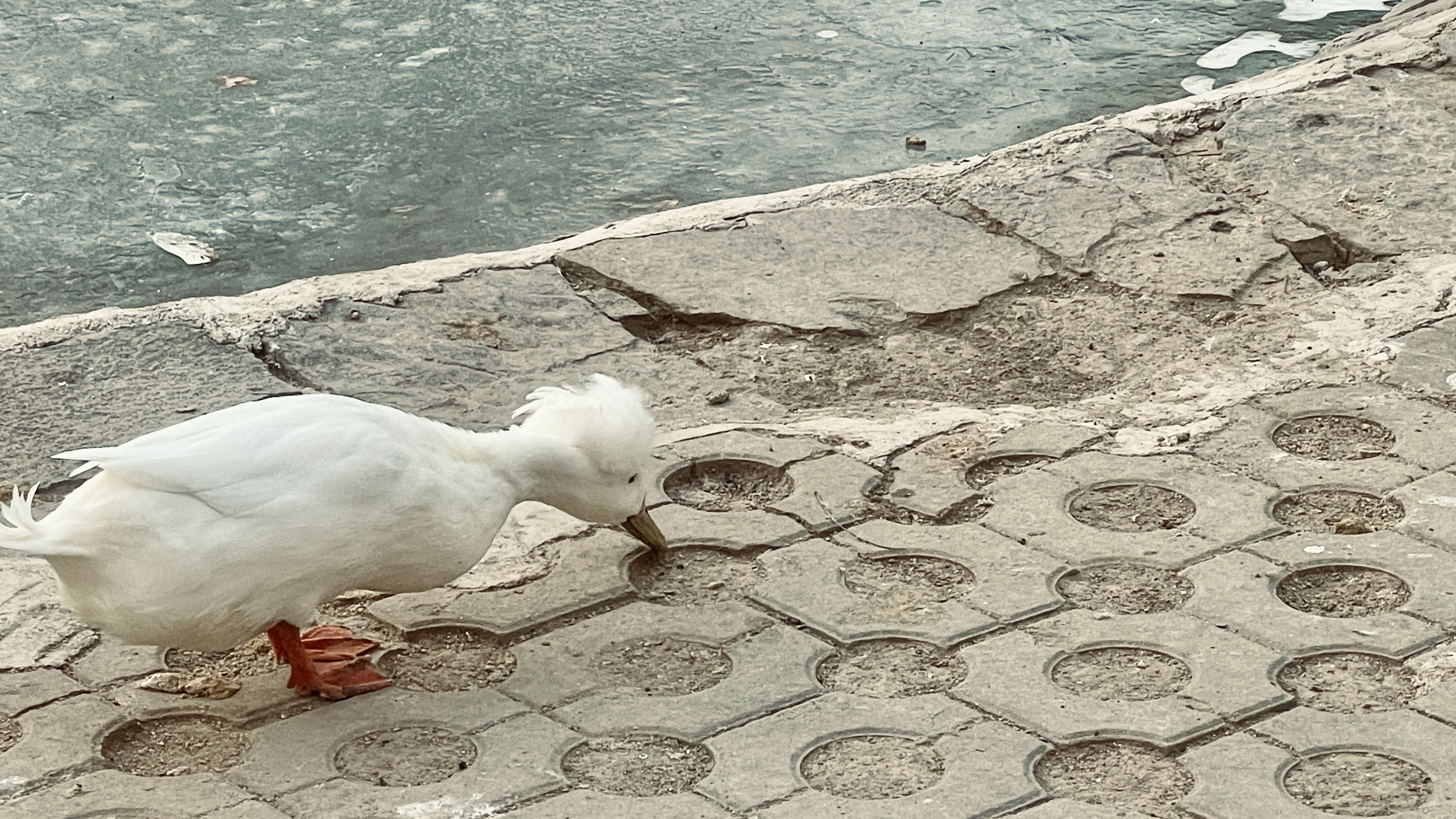
Everyday Details
03 / Film — UNMATURE 2020 Release
A concept-led streetwear film exploring independent thought and self-expression. Found footage, street imagery and graffiti animation shift from the pressure to conform toward the freedom to think and act for yourself.