An ArtCenter student project exploring how personalized information can narrow the range of ideas we encounter. Experimental typography and imagery turn an abstract question about data into a public-facing visual narrative.
FOCUS — Concept Development, Experimental Typography & Campaign Design
STATUS — Concept Proposal
When information is selected for us, what remains outside the frame?
01 — The Question Behind the Project
The brief called for a typographic narrative about isolation. I interpreted isolation as a limit on exposure to knowledge: the possibility that convenient, personalized information can reinforce familiar interests while making other perspectives less visible.
02 — From Convenience to a Critical Perspective
The project considers the contrast between actively searching for information and receiving a stream selected by a platform. Online preferences become the starting point for that selection. The campaign questions what may be lost when convenience replaces open-ended exploration.
03 — Exploring a Visual Language
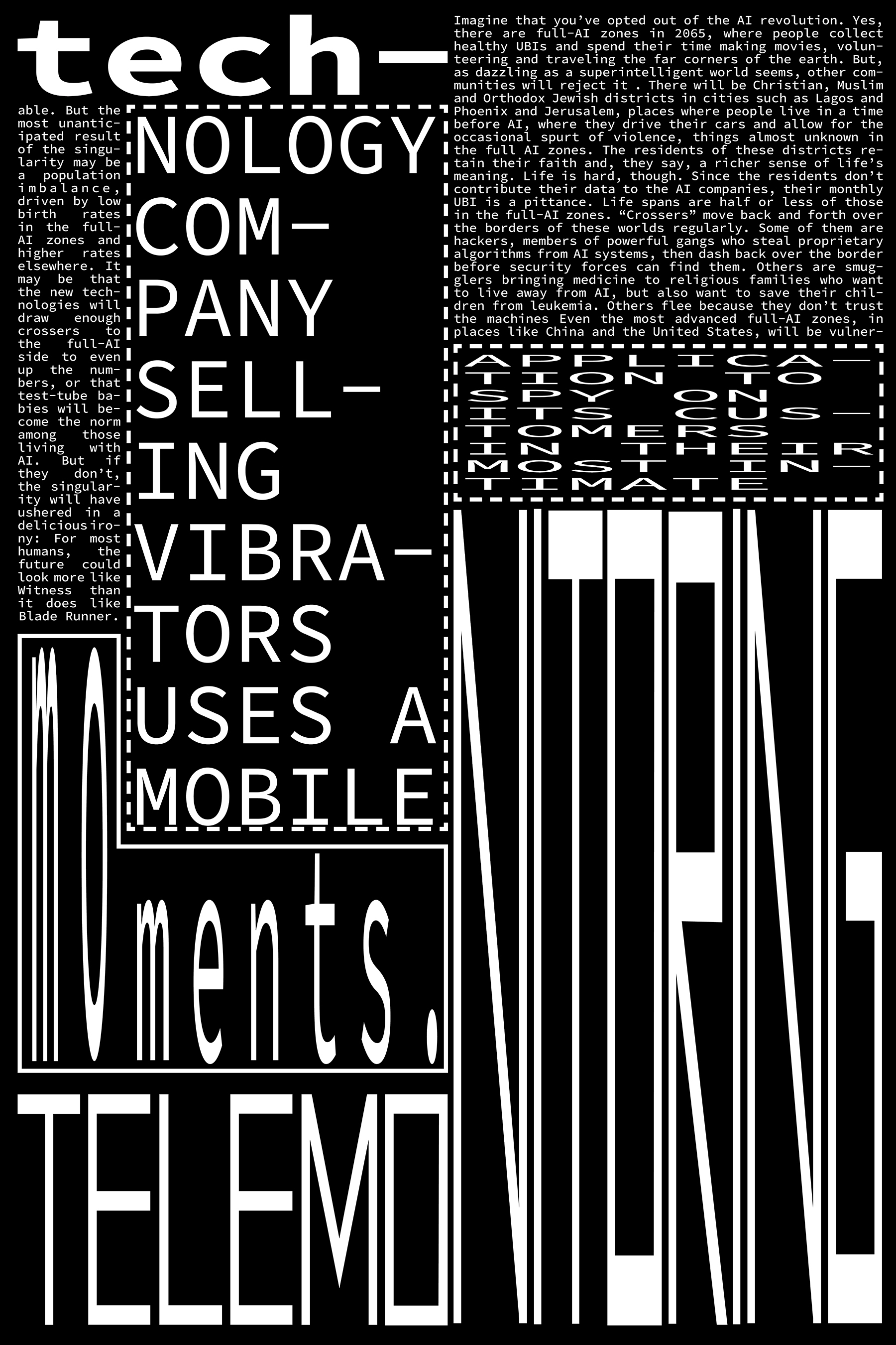
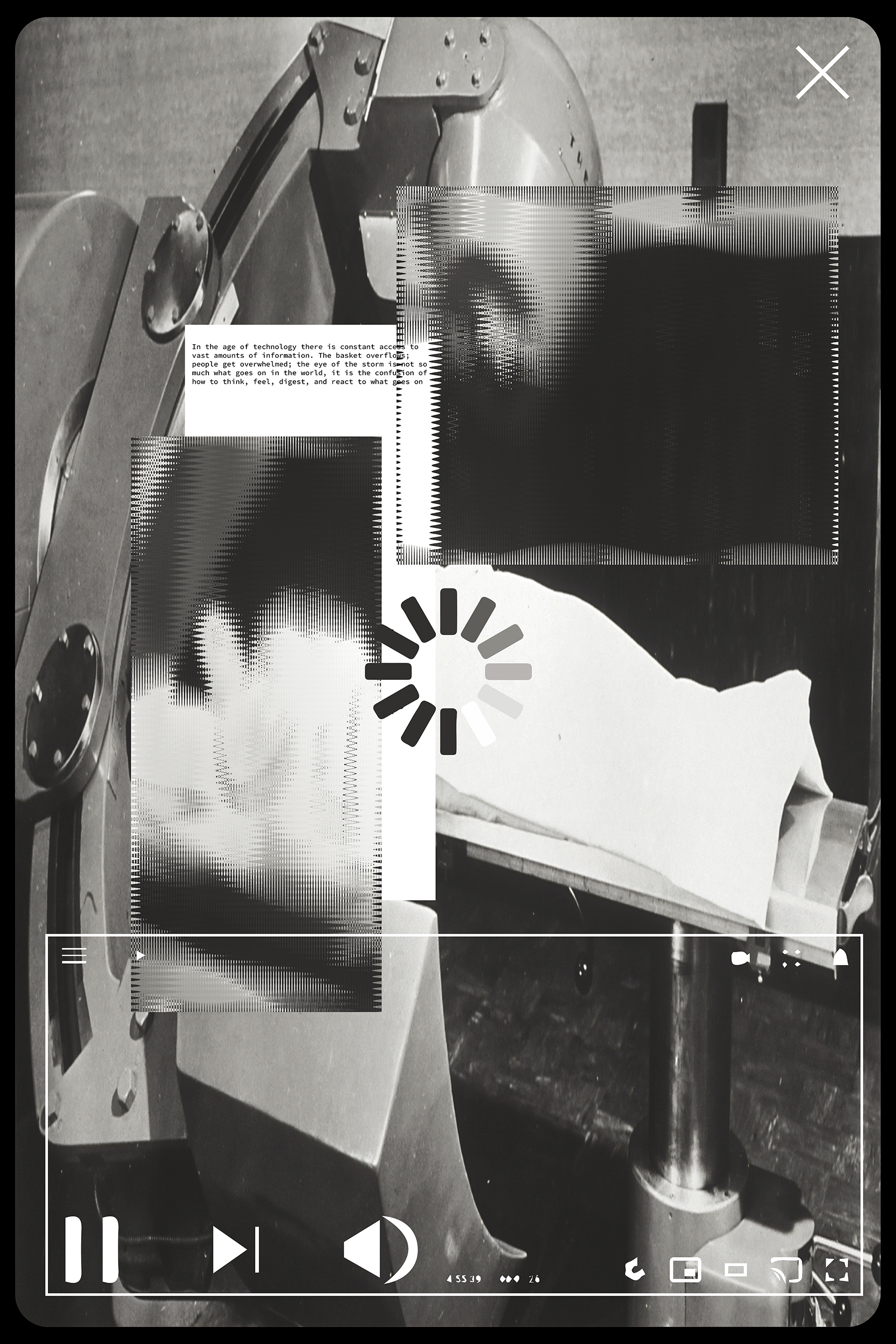
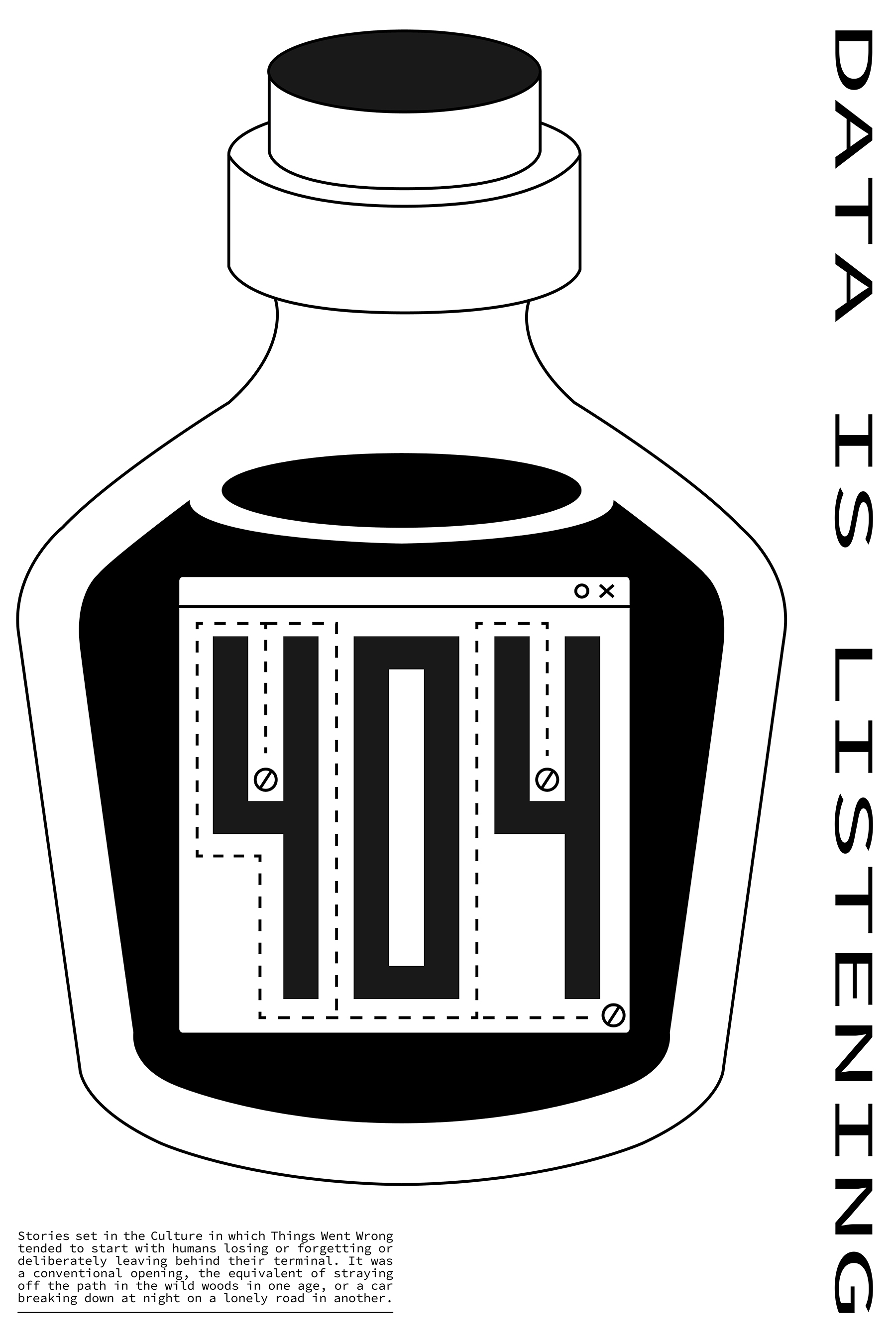
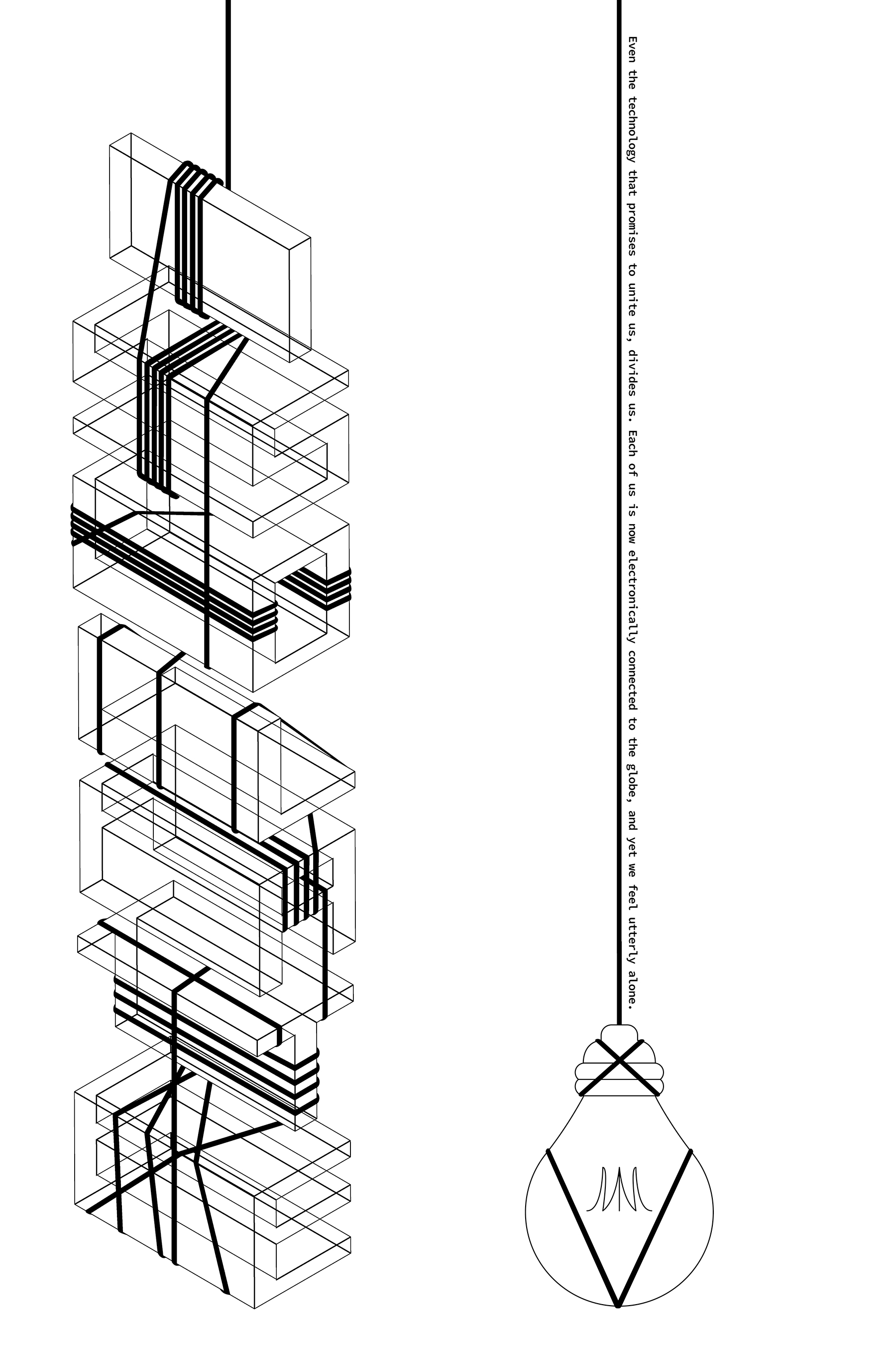
Compressed and stretched letterforms, disrupted reading order, technical diagrams and fragmented images create different ways of expressing the same concern. Black and white holds the series together while the layouts shift between dense information and empty space.


04 — A Series of Provocations
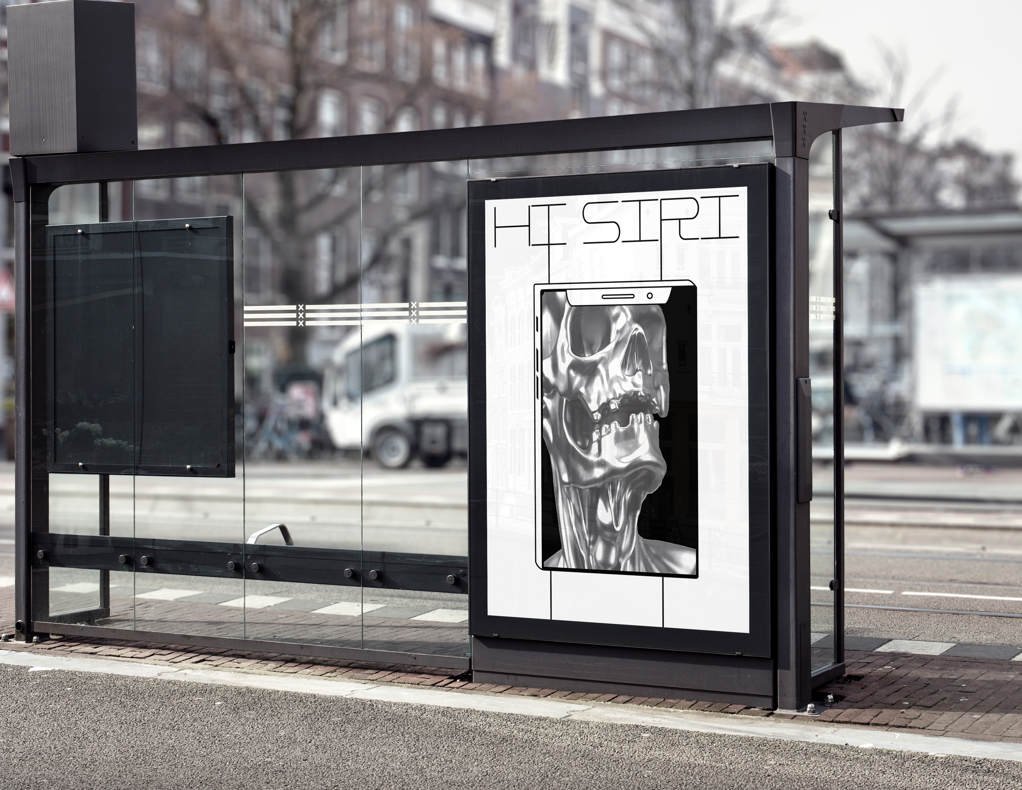
Each poster approaches isolation through a different visual metaphor. The work combines machine-like interfaces, interrupted images and a “404” reference to create questions rather than a single explanatory message. The variety of compositions keeps the concept open to multiple readings.


05 — Taking the Narrative into Public Space
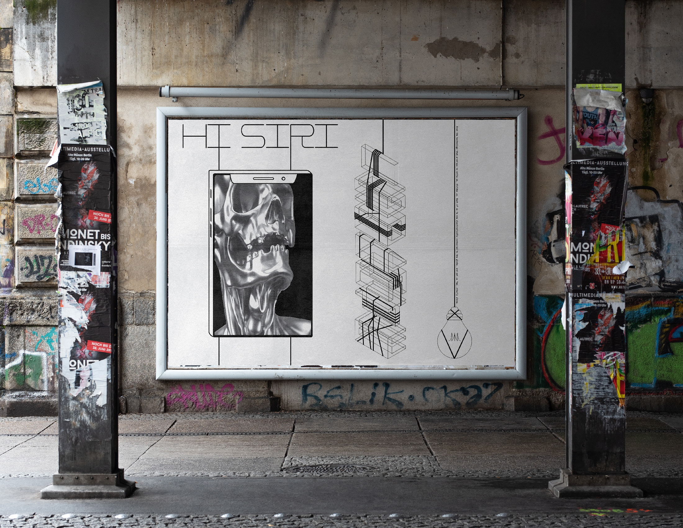
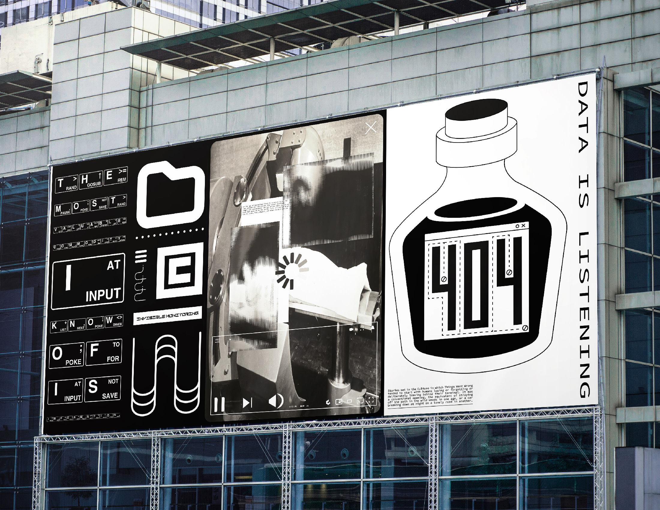
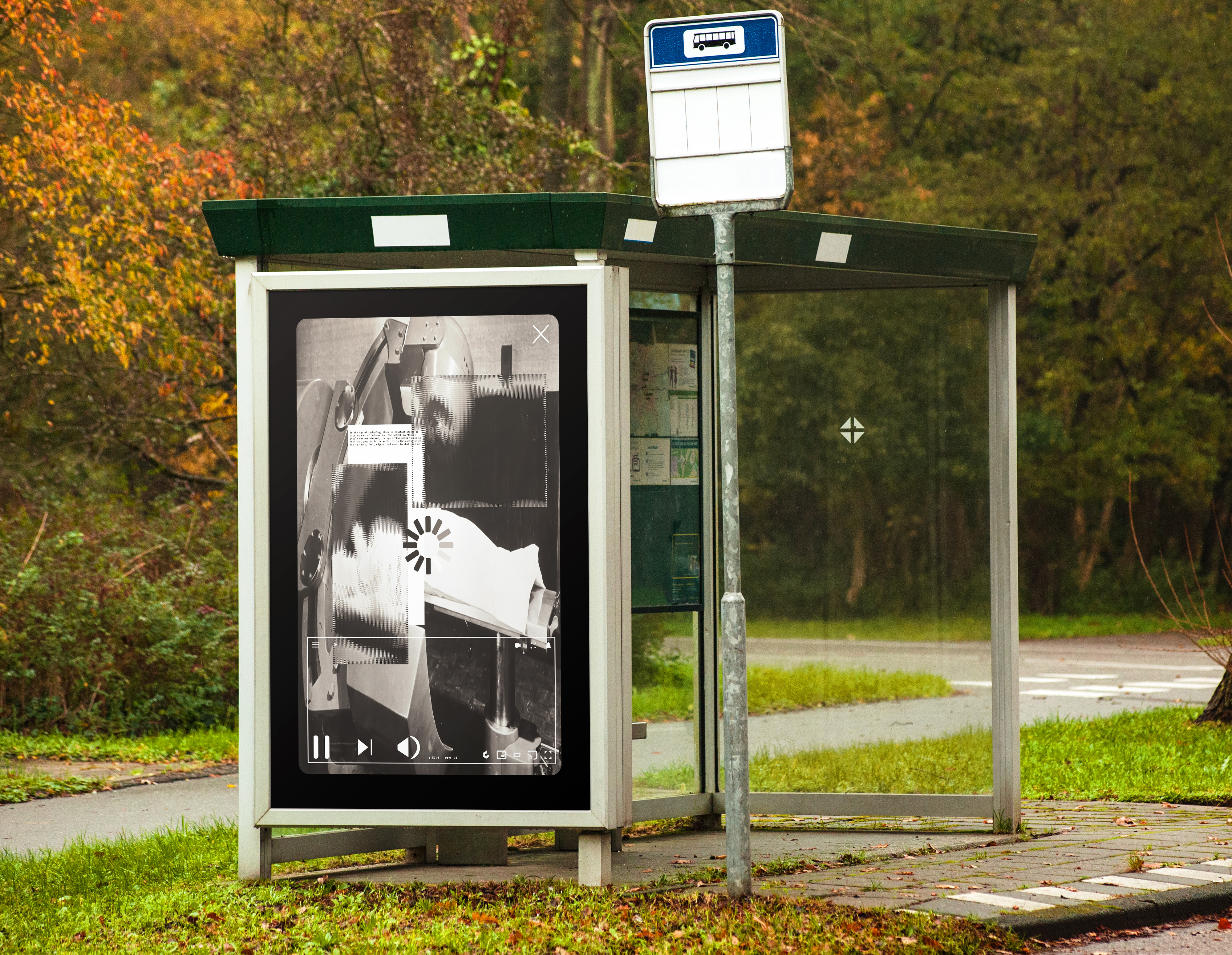
The existing mockups test the poster series at different scales, from transit displays to building facades and billboards. These proposed placements move the question beyond the screen and explore how the work could interrupt a familiar daily environment.





06 — The Design Exploration
The project uses graphic design to make an invisible system discussable. Its value lies in connecting a social question to varied typographic and visual experiments, then considering how those experiments could work as a coherent awareness campaign.
︎︎︎ VISUAL BRANDING:
- lululemon — Dupe Swap Activation
- LA Lantern Art Expo 2024
- lululemon — Chargefeel Launch
- Nike — US Open 2022 Activation
︎︎︎ EDITORIAL:
- Adidas Crazy One
- JP Morgan Chase SC
- Kawabata Yasunari
- Mirror, Reflection of Society
- Naked Lunch Specimen
- ACCD Film Club
- Big Data Isolation
︎︎︎ MOTION:
︎︎︎ PM STUDIO — INDEPENDENT WORK:
- UNMATURE LA — Streetwear Brand
- Real Estate — Photography & Videography
- Aegis Biopharmaceuticals — Brand Design
- Hydun Petcare — Brand Identity
- Visual Explorations
- Custom Sneakers — Art & Design
︎︎︎ COOL&FUN:
︎︎︎ CLIENTS:
- adidas
- Amazon
- Apex Global Groups
- Apple
- Berkshire Hathaway
- Call of Duty
- JPMorgan Chase
- lululemon
- Mico Tequila
- Nike
- Starry
Email: hzhangdesign@gmail.com
Phone: 858.740.9135
Instagram: pmstudiola
©2015 QS Studio llc All Rights Reserved