A rebrand developed through PM Studio, followed from AEGIS’s new wordmark and immunmax packaging all the way to the exhibition floor. Part I covers the delivered identity, packaging and trade show graphics. Part II, The Living Shield, is a self-initiated exhibition concept that asks what the refreshed brand could become as a 9 × 9 m island pavilion.
STUDIO — PM Studio
SCOPE — Logo, Packaging, Trade Show Graphics & Exhibition Concept
STATUS — Part I delivered through PM Studio · Part II speculative concept, not commissioned or built
TOOLS — Illustrator, Blender, Cycles
Identity, packaging and trade show graphics delivered through PM Studio.
01 — The Brief & Design Scope
AEGIS works in botanical health biotechnology. The design brief was to modernize its visual identity and carry that direction through packaging and exhibition materials.
Through PM Studio, I worked on the logo redesign, packaging and trade show branding. The central design challenge was consistency: the corporate name, product identity and larger exhibition graphics needed to feel like parts of the same brand.
02 — Identity: From Symbol to Wordmark
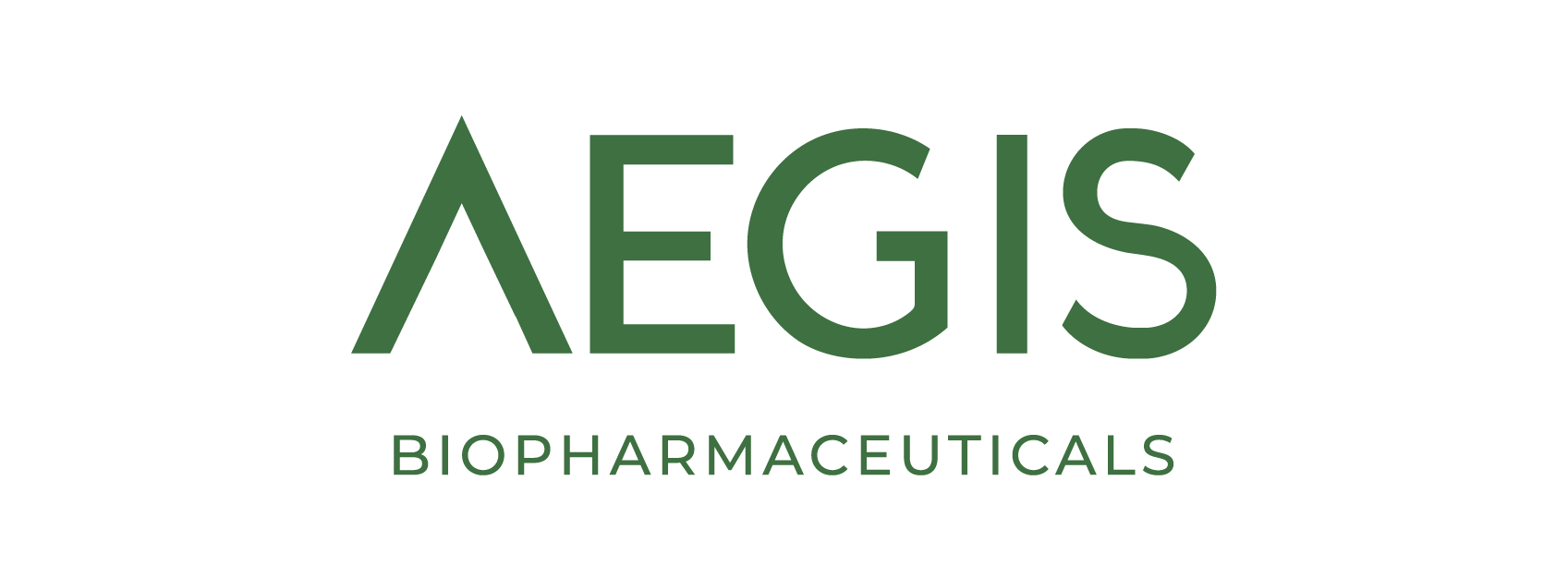
The original identity combined a geometric symbol with a lowercase wordmark. The updated identity places emphasis on a simple uppercase AEGIS wordmark, with an open, angular A and the company descriptor beneath it.
This gives the name a more direct presence. A restrained green palette connects the identity to the botanical category, while the simplified letterforms keep the mark clear across different applications.

03 — Connecting Company & Product
The packaging separates two levels of recognition: AEGIS identifies the company, while immunmax identifies the product. Their distinct typographic voices work within a shared, restrained presentation.
On the bottle and carton, the company mark sits above the product name and supporting information. Green surfaces and light lettering connect the two formats, with space around each element to maintain a clear reading order.


04 — The Identity in a Trade Show Setting
The exhibition graphics extend the same hierarchy into a larger environment. Company and product names establish recognition, while large headlines introduce the message from a distance.
The display panels and reception counter use the same brand vocabulary as the packaging. These retouched presentations show the relationship between the identity, product communication and physical presentation.


The first booth proved that the identity could hold at exhibition scale. It also showed a limit: wrapping every surface in saturated green made the space read as promotional rather than scientific. That tension became the starting point for Part II.
Speculative concept — not commissioned or built. Modelled and rendered in Blender.
05 — From Booth Graphics to a Pavilion

I went back to the brand work and the AEGIS website before drawing anything. Four findings shaped the brief:
Phyto-P™, the polyphenol complex behind the products, is invisible, so the space has to make it visible. The company leads with partnerships and third-party validation, so the booth needs a private place to talk. Only immunmax is on the market, while Epiatrix, Aegis Derma and Terra & Solis are coming soon, and that should be shown honestly. And the new wordmark is quiet and precise, while the old booth was loud.
The direction followed: move from a green-wrapped promotional booth to a white, laboratory-like pavilion where green appears only as a signal.
06 — Concept: The Living Shield
In Greek myth the aegis is a protective shield, and AEGIS protects health with plants. The pavilion is an open shield wrapped around a living core, where a plant turns into a molecule in front of the visitor.
Three ideas come from the brand itself. Shield: a concave product wall and a screen of white fins protect the north and east, while the south and west stay open to the aisles. Extraction: a 3 m glass column holds living moss at its base and a rising helix of light above it. Polyphenol: polyphenols are built on aromatic rings, so the hexagon becomes the system for the canopy, hanging sign, floor inlays and media graphics.

07 — Design Direction
The comparison below sets the direction. Clinical clarity comes from white surfaces borrowed from the laboratory. Botanical warmth comes from real moss and leaves at the core. Light stands in for technology through light lines, a glowing core and a backlit product wall rather than screens everywhere. Brand hierarchy carries over from the packaging: AEGIS names the company, immunmax™ names the product.


08 — Plan & Visitor Journey
An 81 m² island, open on all four sides. The Phyto-P™ core stands at the exact centre, so it is the first thing seen from every aisle. Everything that needs privacy, the meeting room and storage, is pushed into the north corners behind the shield. Everything that needs footfall faces the main aisle.

Three audiences meet in four moments. Sample: the reception counter faces the main aisle, one step from an immunmax™ sample. Learn: the lab bench and LED media wall explain Phyto-P™ with real glassware and touch screens. Discover: the pipeline wall shows one available product and three coming soon, presented as frosted vessels instead of invented packaging. Partner: the lounge and frosted meeting room host distributors and investors.


09 — The Pavilion
Because an island booth has no back, every face carries the brand. The rear of the pipeline wall holds the real tagline, “It’s not magic. It’s super natural.”, and the six-sided hanging sign alternates the AEGIS and immunmax™ marks so both read from any direction.


Four layers each do one job. The sign identifies, the canopy defines the space without walls, the core and pipeline wall tell the science and product story, and the 60 mm platform organises the programme with bevelled edges for step-free access.
10 — The Phyto-P™ Core
A 1.4 m glass column, 3 m tall. Moss and leaves at the base stand for the plant source, a double helix of light for extraction, and three small hexagons at the top for the polyphenol. An early version used solid glass, which acted like a lens; it was rebuilt as a thin hollow tube, closer to a real display column.


11 — Programme Details


12 — One Brand Across Multiple Scales
The project follows one identity through four scales: a wordmark, a bottle and carton, a set of trade show graphics and, as a concept, a full pavilion. The hierarchy stays the same at every step, with AEGIS as the company and immunmax as the product, and the green narrows from a background into a signal as the space around it grows.
︎︎︎ VISUAL BRANDING:
- lululemon — Dupe Swap Activation
- LA Lantern Art Expo 2024 — Festival Planning & Spatial Design
- lululemon — Chargefeel Launch
- Nike — US Open 2022 Activation
︎︎︎ EDITORIAL:
- Adidas Crazy One
- JP Morgan Chase SC
- Kawabata Yasunari
- Mirror, Reflection of Society
- Naked Lunch Specimen
- ACCD Film Club
- Big Data Isolation
︎︎︎ MOTION:
︎︎︎ PM STUDIO — INDEPENDENT WORK:
- UNMATURE LA — Streetwear Brand
- Real Estate — Photography & Videography
- AEGIS Biopharmaceuticals — Rebrand & Exhibition Design
- Hydun Petcare — Brand Identity & Pop-up Design
- Visual Explorations
- Custom Sneakers — Art & Design
︎︎︎ COOL&FUN:
︎︎︎ CLIENTS:
- adidas
- Amazon
- Apex Global Groups
- Apple
- Berkshire Hathaway
- Call of Duty
- JPMorgan Chase
- lululemon
- Mico Tequila
- Nike
- Starry
Email: hzhangdesign@gmail.com
Phone: 858.740.9135
Instagram: pmstudiola
©2015 QS Studio llc All Rights Reserved