A visual identity and packaging system for everyday pet-care products, carried from the shelf into space. Part I covers the delivered identity, dog illustrations and packaging. Part II, The Grain House, is a self-initiated pop-up store concept that turns the brand’s wood grain, its friendly dog and its compostable promise into a 3 × 4 m space in a shopping-mall atrium.
STUDIO — PM Studio
SCOPE — Visual Identity, Illustration, Packaging & Pop-up Concept
PRODUCTS — Training Pads & Pet Waste Bags
STATUS — Part I delivered through PM Studio · Part II speculative concept, not commissioned or built
TOOLS — Illustrator, Blender, Cycles
Identity, illustration and packaging delivered through PM Studio.
01 — The Brief & Design Approach
The project developed a new visual identity and package design for Hydun’s pet-care range. The challenge was to create a recognizable family for products with different formats and uses.
The design brings together the company mark, illustrated product cues and clear packaging hierarchy. Each element has a role: the logo establishes the brand, the dog introduces the use case, and the text explains the product.
02 — A Friendly Identity
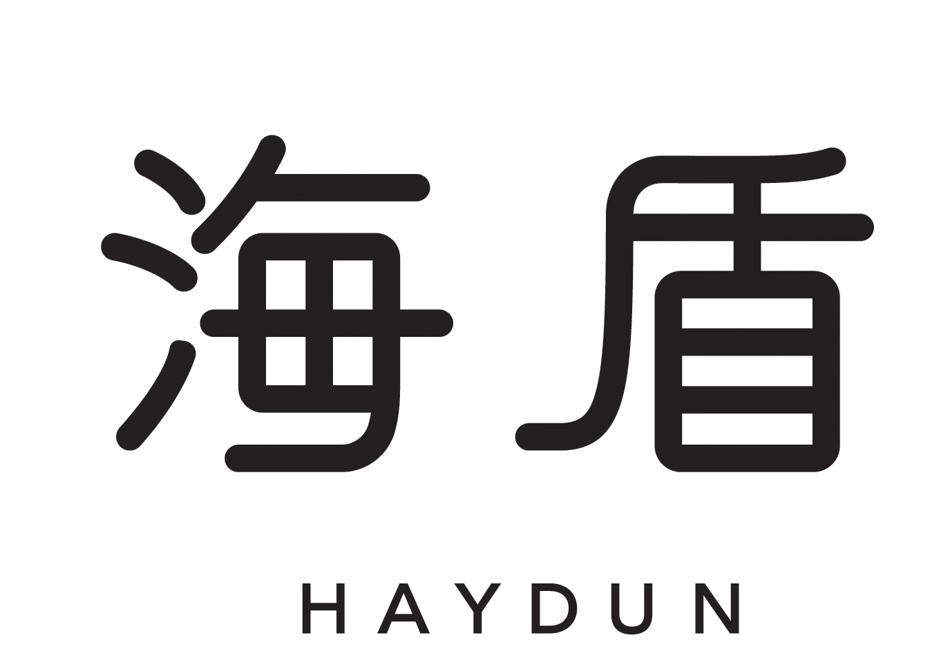
The company mark pairs rounded Chinese lettering with a spaced Latin wordmark. The heavy, softened strokes give it a clear silhouette, while the simpler lettering beneath provides contrast.
That balance carries into the illustration style. Bold outlines and simplified shapes create a playful personality that remains legible alongside product information.
03 — Illustration as Product Communication
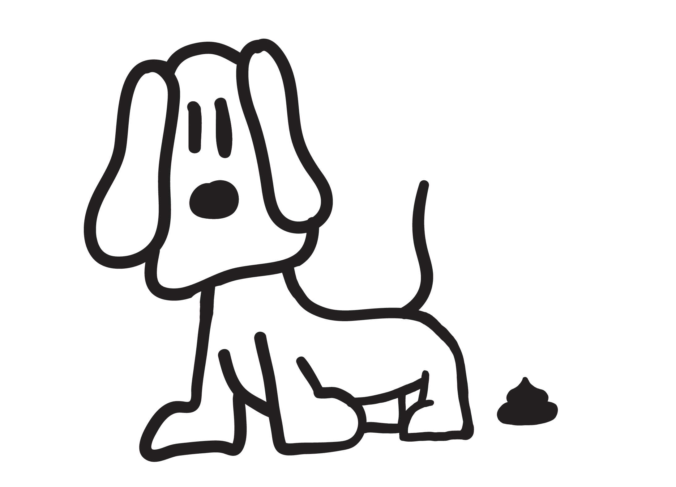
The dog illustrations show two everyday situations: waste collection and using a training pad. The character links the range together while the surrounding details distinguish what each product is for.
The repeated line weight, facial features and rounded forms make the illustrations feel like one visual vocabulary. They add personality and give the packaging a recognizable cue beyond the brand name.

04 — From Flat Artwork to Packaging
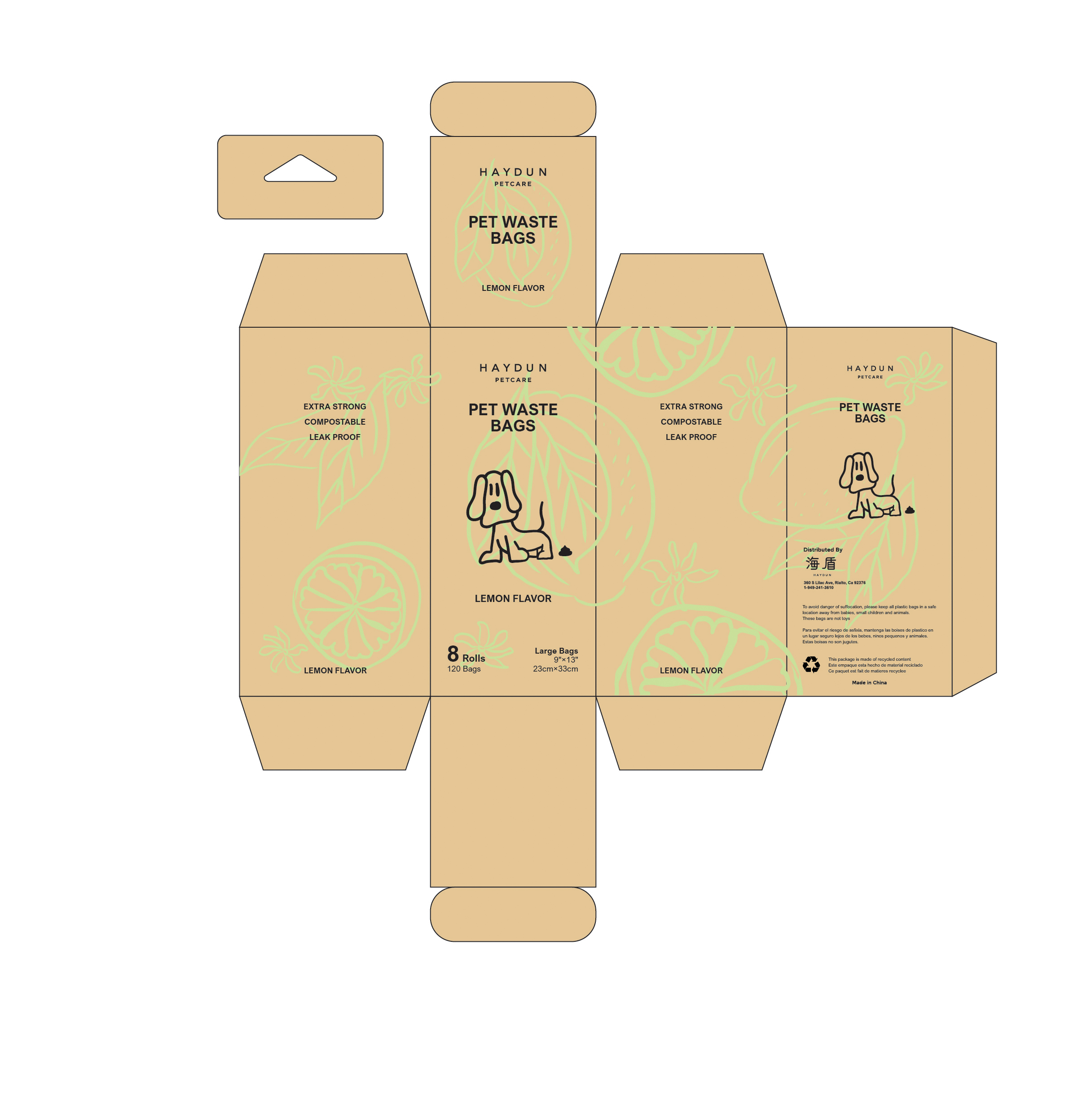
The packaging artwork shows how the visual system is organized across panels. Brand, product name and illustration establish the main reading order, with supporting specifications given their own space.
The training-pad layout and waste-bag carton use related warm colors and the same character language. Different panel structures accommodate their product formats while preserving a consistent family appearance.

05 — The Product in Context
The product images bring the flat artwork into an everyday pet-care setting. They show the relationship between the packaging, the product and its intended use, completing the sequence from identity to application.


Together, the identity, illustration and package layouts demonstrate a system that balances a warm brand voice with practical information.
On a shelf, though, the brand’s biggest ideas — natural materials and a bag that goes back to soil — stay printed in small type. Part II asks what happens when that promise is given a place people can walk into, touch and remember.
Speculative concept — not commissioned or built. Modelled and rendered in Blender.
06 — From Pack to Place

Four findings shaped the brief. The wood grain is what people remember from the pack, so at 3 m tall it can become architecture. “Compostable” is a claim on a carton; a display that shows a bag returning to soil turns it into something visitors can see. The line-drawn dog is friendlier than any headline, and at life size it becomes a landmark and a photo moment. And a mall-atrium pop-up is seen from four sides and from the floor above: it has to read in three seconds and assemble in one night.
07 — Concept: The Grain House
Every dog knows what a house is. The pop-up is a dog house cut from the wood grain of the pack — a home for the products, a frame for the dog, and a stage for the moment a bag goes back to soil.

08 — Design Direction & Materials
Natural materials only: birch ply, oak, cork, kraft and live plants, with no glossy laminate or plastic signage. Every word on the pop-up comes from the packs — Made with natural material, Compostable, Leak proof. Parts are flat-pack and demountable for a night install and reuse at the next mall, and the corners, water station and pad demo are designed at dog height.


09 — Plan & Visitor Journey
A 3 × 4 m island on an 80 mm oak-edged cork deck, open on all four sides. The Grain House closes the north edge so the atrium side gets a full graphic; the counter faces the main approach; the soil display and tree face west; the pet corner and dog board take the east, where people with dogs arrive.

Four moments. Sample: take a roll of lemon-scented bags or feel a training pad at the counter. Discover: the full range sits inside the Grain House, lit warm from under each shelf. Return: four tubes show the bag’s journey back to soil next to a living tree — an illustrative display. Play: a cork-and-moss mat, a water bowl and the life-size dog welcome visitors who brought their own.


10 — The Pop-up
Seen from the concourse, the pop-up reads as one simple shape — a house — in the colour and grain of the pack. The logo sits in the gable, as a house carries its name, and the north face carries the dog and the pack claims so the back of the house is never a blank wall.


All parts are flat-pack birch, oak and kraft panels with bolted joints, sized to travel in one van and be rebuilt at the next location; the plants and soil are the only parts that stay behind.
11 — The Grain House
The house is 2.4 m wide, 3.0 m to the ridge and 0.8 m deep. Its 250 mm walls are clad outside in the pack’s orange wood grain and edged in birch ply, so the cut edge shows its layers. Inside, two birch shelves and a storage plinth hold the full range, each lit by a warm LED strip under the front edge. Three oak growth rings hang above and mark the pop-up from across the mall and from the floor above.


12 — Programme Details


13 — One Brand, From Pack to Place
The project follows one system through four scales: a logo, a character, a pack and, as a concept, a place. The rounded line, the wood grain and the kraft-and-lime palette never change; they simply grow until a visitor can stand inside them. The pop-up keeps the brand’s promise in the way it is made — natural materials, honest claims taken from the packs, and parts that can be packed up and used again.
︎︎︎ VISUAL BRANDING:
- lululemon — Dupe Swap Activation
- LA Lantern Art Expo 2024 — Festival Planning & Spatial Design
- lululemon — Chargefeel Launch
- Nike — US Open 2022 Activation
︎︎︎ EDITORIAL:
- Adidas Crazy One
- JP Morgan Chase SC
- Kawabata Yasunari
- Mirror, Reflection of Society
- Naked Lunch Specimen
- ACCD Film Club
- Big Data Isolation
︎︎︎ MOTION:
︎︎︎ PM STUDIO — INDEPENDENT WORK:
- UNMATURE LA — Streetwear Brand
- Real Estate — Photography & Videography
- AEGIS Biopharmaceuticals — Rebrand & Exhibition Design
- Hydun Petcare — Brand Identity & Pop-up Design
- Visual Explorations
- Custom Sneakers — Art & Design
︎︎︎ COOL&FUN:
︎︎︎ CLIENTS:
- adidas
- Amazon
- Apex Global Groups
- Apple
- Berkshire Hathaway
- Call of Duty
- JPMorgan Chase
- lululemon
- Mico Tequila
- Nike
- Starry
Email: hzhangdesign@gmail.com
Phone: 858.740.9135
Instagram: pmstudiola
©2015 QS Studio llc All Rights Reserved